Main Menu
collapse

Resources

2024-2025 SOTG Tally


2024-25 Season SoG Tally
Jones, K.10
Mitchell6
Joplin4
Ross2
Gold1

'23-24 '22-23
'21-22 * '20-21 * '19-20
'18-19 * '17-18 * '16-17
'15-16 * '14-15 * '13-14
'12-13 * '11-12 * '10-11

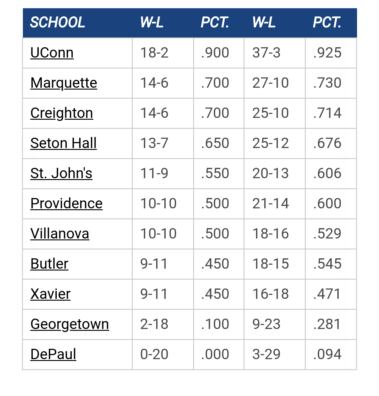
Big East Standings

Recent Posts

2025-26 Schedule by ChuckyChip
[September 12, 2025, 03:48:51 PM]


Any Updates On Men's Basketball Practice Facility Funding? by TedBaxter
[September 12, 2025, 03:22:21 PM]

Please Register - It's FREE!

The absolute only thing required for this FREE registration is a valid e-mail address. We keep all your information confidential and will NEVER give or sell it to anyone else.
Login to get rid of this box (and ads) , or signup NOW!

Next up: A long offseason

Marquette
66
Marquette
Scrimmage
Date/Time: Oct 4, 2025
TV: NA
Schedule for 2024-25
New Mexico
75

Hards Alumni

Quote from: Blue Horseshoe on September 02, 2011, 03:22:28 PM
Could be the bus stop on 16th w/ McCormick in the background.

The building is the 'lanche, and at the bottom is Farley's dopey mug.

StillAWarrior

Quote from: StillAWarrior on September 02, 2011, 10:03:29 AM
If you look at the full size of the photo, you can clearly see the perforation on the back.  What's that sticking up among the perforation in the middle?  Is it Marquette Hall?  Looks like it's probably Crowder's jersey in the picture.


I just realized that my earlier post was a nice example of "missing the forest for the trees."  I was looking at the "W" and partial "O" in the name on the back of the jersey and brilliantly deduced that it was "probably" Crowder's jersey.  That big "32" on the front might have been a decent clue as well.  Doh!
Never wrestle with a pig.  You both get dirty, and the pig likes it.

T-Bone

I'm like a turtle, sometimes I get run over by a semi.

Bocephys


oldwarrior81


Hards Alumni

Quote from: Hards_Alumni on September 02, 2011, 03:24:32 PM
The building is the 'lanche, and at the bottom is Farley's dopey mug.

Holy crap.  I just realized that there are probably kids starting at Marquette that have never heard of Chris Farley...

He died 14 years ago.

Kids who are starting at Marquette were 4 years old when he died.

Skatastrophy

Quote from: Hards_Alumni on September 02, 2011, 04:42:36 PM
Holy crap.  I just realized that there are probably kids starting at Marquette that have never heard of Chris Farley...

He died 14 years ago.

Kids who are starting at Marquette were 4 years old when he died.

Knock it off!  Fridays are supposed to be happy days :(

Hards Alumni

Quote from: Skatastrophy on September 02, 2011, 04:45:32 PM
Knock it off!  Fridays are supposed to be happy days :(

Just drink a bunch of beer and forget this conversation ever existed.

77ncaachamps

If Kentucky has the state at the top, why couldn't it be Wisconsin at the top of the jersey back?

I do wonder if they're going to use the "Super Chicken" Golden Eagle logo at the bottom back of the jersey.
SS Marquette

Skitch

I have it on pretty good authority that the image on back will be Freeway, Ziggy and the "Jesus Saves" cross from the rescue mission.

MUMac

Quote from: 77ncaachamps on September 02, 2011, 06:24:22 PM
If Kentucky has the state at the top, why couldn't it be Wisconsin at the top of the jersey back?

Kentucky is the state university, Marquette is not. 

muhs03

I dont think it even matters what's on the back of the jerseys. With the light and player sweat, its virtually impossible to make out what the designs even are....even on HD!!! It's not like fans from other schools are going to say, "Hey look, that's Marquette Hall on their back."

Skatastrophy

Quote from: muhs03 on September 03, 2011, 04:12:53 PM
I dont think it even matters what's on the back of the jerseys. With the light and player sweat, its virtually impossible to make out what the designs even are....even on HD!!! It's not like fans from other schools are going to say, "Hey look, that's Marquette Hall on their back."

Exactly.  All game it'll look like a oddly patterned sweat stain.

muhs03

Quote from: Skatastrophy on September 03, 2011, 04:17:28 PM
Exactly.  All game it'll look like a oddly patterned sweat stain.

Ha! Exactly. That technology was introduced several seasons ago and for the teams that were the first to use it, I have no idea what their designs are. If someone is really interested in knowing, I guess you have to look it up on the internet. When you have to do that, whats the freaking point?

National Champs

Quote from: Skatastrophy on September 03, 2011, 04:17:28 PM
Exactly.  All game it'll look like a oddly patterned sweat stain.

But if it is actually a picture of an oddly patterned sweat stain, what will it look like all game?
We Are Elite

muhs03

Quote from: National Champs on September 03, 2011, 04:29:06 PM
But if it is actually a picture of an oddly patterned sweat stain, what will it look like all game?

Depends on how many mushrooms you eat.

DJO's Pump Fake


GGGG

OK...I can deal with that.  Glad to see that there is no chicken.  Those who guessed Marquette Hall were correct.  The Al is OK I guess.  Love that "1881" and "Cura Personalis" is on there.

MUMac

Quote from: DJO's Pump Fake on September 06, 2011, 09:17:34 AM
And HERE they are:

http://yfrog.com/18copcj

That will take some getting used to.  I like the choices.  Will withhold formal judgment until I see it live and on TV.

BobWildLoyalist

I am not crazy about graphics on the back of jerseys. But if we are going to do it, this does not look that bad. Could be worse.

Buzz Williams' Spillproof Chiclets Cup

#270


Sorry. Take away my Warrior Card, but that's ugly. They remind me of the knockoff soccer jerseys you'd see being sold on the street in Pilsen, with a player's name and number on the back, and a picture of that same player on the jersey itself, or those god-awful NBA Raptors, Grizzlies, Rockets, and Hawks jerseys of the late 90s.

The elements are disjointed, and the end result looks like a kindergartener's magazine collage. I don't understand what was wrong with nothing on the back but the player's name and number. Take away the back design and it's as good a uniform as I've ever seen Marquette in. The back design, while probably designed with the best of intentions and substantial imput from the University, is just so completely and utterly unnecessary.

The irony is that MU's press release will likely say the new uniform's back design makes it "uniquely Marquette," when in reality, MU's jerseys were already unique, and by copping to Nike's back-design template, they have actually made Marquette's uniforms LESS unique.


Maybe they'll grow on me, but for now, I think they're pretty fugly.
“These guys in this locker room are all warriors -- every one of them. We ought to change our name back from the Golden Eagles because Warriors are what we really are." ~Wesley Matthews

wyoMUfan

I have to agre, they looks disoriented - lost.
like were trying too hard to put as much on the back of a bball jersey are possible.
I think mu hall / 1881 would have been enough this looks like a ransom note to the rest of college basketball asking to be accepted w/ the dukies, msu's, etc.
(at least it doesn't read " go zags")

g0lden3agle

Whats the point of having images like these on the back of the Jersey if the player's number is just going to cover up half of the details?  The fact that Al's face is squarely under the #2 is pretty silly.

martyconlonontherun

#273
IMHO, too much detail and too many elements. Nothing wrong with trying the concept but I like a more subtle feel to those types of jerseys. I would have just had some simple repeating text with the Curas Personalis theme, or one large Al logo, or the a huge MU logo that blends in better with curas personalis underneath. It also seems weird that it is just in the middle of the jersey and is cut off at the bottom and sides.

Blue Horseshoe

Agreed, these are disappointing. They look like something for kids with Al's arms extended. It looks like a pair of arms looking for a hug.

WHY??? WHY HAVE YOU FORSAKEN ME AGAIN MARQUETTE?!?!

Previous topic - Next topic