collapse

Resources

2024-2025 SOTG Tally


2024-25 Season SoG Tally
Jones, K.10
Mitchell6
Joplin4
Ross2
Gold1

'23-24 '22-23
'21-22 * '20-21 * '19-20
'18-19 * '17-18 * '16-17
'15-16 * '14-15 * '13-14
'12-13 * '11-12 * '10-11

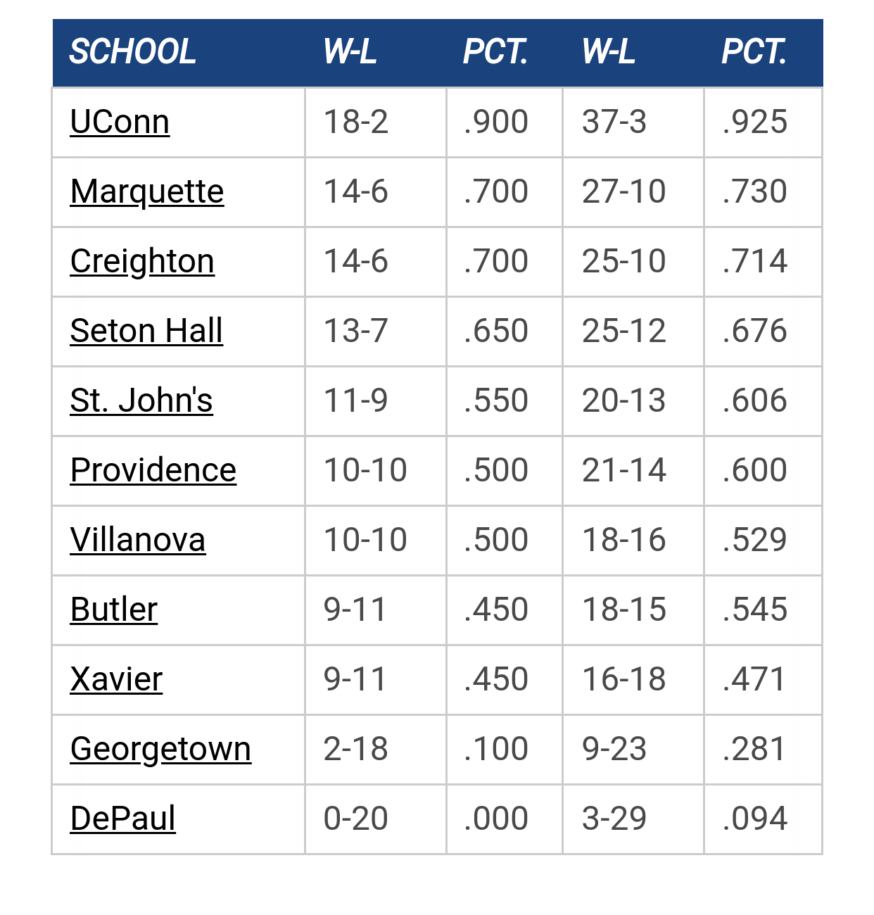
Big East Standings

Recent Posts

Pearson to MU by BCHoopster
[Today at 06:07:37 PM]


2026 Bracketology by tower912
[Today at 06:03:10 PM]


Marquette vs Oklahoma by Jay Bee
[Today at 06:00:08 PM]


Kam update by MuMark
[Today at 04:38:16 PM]


Psyched about the future of Marquette hoops by Hards Alumni
[Today at 02:13:17 PM]


Recruiting as of 5/15/25 by StillAWarrior
[Today at 12:56:16 PM]


Nov 28: MU vs OU in Chicago by Warrior of Law
[Today at 10:10:18 AM]

Please Register - It's FREE!

The absolute only thing required for this FREE registration is a valid e-mail address. We keep all your information confidential and will NEVER give or sell it to anyone else.
Login to get rid of this box (and ads) , or signup NOW!

Next up: A long offseason

Marquette
66
Marquette
Scrimmage
Date/Time: Oct 4, 2025
TV: NA
Schedule for 2024-25
New Mexico
75

Eldon

Quote from: Billy Hoyle on March 13, 2018, 05:14:52 PM
The stripes all the way down the sideline would be cool but those have been prohibited since the old Philly Spectrum court.  Sidelines have to be a solid color.

I like the huge MU in the middle but not with the Marquette banner.  I remember that eventually that was supposed to go away.  Having to put the name of the school in your logo is small time.  The MU is recognized now on its own.

I wouldn't mind a return to the 2002 and 2003 unis with the block lettering.  I like Nova and Xavier's simple 80's throwbacks that they've busted out.  Maybe add in the camo from the Doc Rivers days.

Source?

I like the banner on the logo.

El Duderino

#76
Quote from: SERocks on March 12, 2018, 02:22:44 PM
This year's uniforms are hideous, bland and boring.  Kinda match the demeanor of the coach.  Nothing flashy, utilitarian.

My thoughts exactly

For many years, i thought Marquette stuck out as having different and great looking uniforms compared to most other teams.

These current Nike ones are as bland as it gets. Like something you'd see on some random rural high school basketball team trying to pinch pennies.

Yawn

SaveOD238

Quote from: ZenyattasTapitColt on March 13, 2018, 08:21:23 PM
While the PC police most likely wouldn't allow an image of Gesu on the court, wouldn't Marquette Hall look cool at center court? Didn't Tom Crean-era BC have this image on the floor, or am I not remembering correctly? DUKE did this at one time with one of their academic buildings. I know I have a gold Crean-era MU Hoops tee with Marquette Hall positioned prominently.

It was on the "watermark" on the back of the jerseys, right above Al's victory pose.

Chili

Quote from: Eldon on March 13, 2018, 08:53:17 PM
Source?

I like the banner on the logo.

It's true - original design guidelines stated it would be dropped for the the MU wordmark. It was originally intended as a bridge to help people understand that the new MU was Marquette and not another university. For one reason or another they moved the banner logo to the primary athletics logo. You can read the full brand guidelines here: https://www.marquette.edu/omc/documents/MU%20Logo%20Standards.pdf
But I like to throw handfuls...

GGGG

Quote from: Chili on March 14, 2018, 09:32:31 AM
It's true - original design guidelines stated it would be dropped for the the MU wordmark. It was originally intended as a bridge to help people understand that the new MU was Marquette and not another university. For one reason or another they moved the banner logo to the primary athletics logo. You can read the full brand guidelines here: https://www.marquette.edu/omc/documents/MU%20Logo%20Standards.pdf


I'm wondering if they eventually will just adapt the secondary logo.  It seems odd to have both in use.

Its DJOver

Take 2 for anyone interested.

Threw on the MECCA shading and really like it

Center court is better, but still not convinced it would be an improvement over what we have now

Think the Big East logo pops better as gold instead of white, based off a quick google search the logo is white or blue for everybody, is this a rule? I would think that as long as you have the logo you can make it whatever color you want.

Put Marquette on the baseline per a suggestion, not sold.  Really hard to get letters to show up well on bumblebee

Played around briefly with putting a silhouette of Al somewhere, but it looked extremely cheesy however I set it up.

Keep the suggestions coming. 
Scoop motto:
Quote from: ATL MU Warrior on February 06, 2025, 06:04:29 PMthe stats bear that out, but

Billy Hoyle

Quote from: Eldon on March 13, 2018, 08:53:17 PM
Source?

I like the banner on the logo.

It was part of the initial logo rollout.

We shouldn't have to remind everyone "hey, this 'MU' stands for Marquette."
"Kevin thinks 'mother' is half a word." - Mike Deane

Previous topic - Next topic