Main Menu
collapse

Resources

2024-2025 SOTG Tally


2024-25 Season SoG Tally
Jones, K.10
Mitchell6
Joplin4
Ross2
Gold1

'23-24 '22-23
'21-22 * '20-21 * '19-20
'18-19 * '17-18 * '16-17
'15-16 * '14-15 * '13-14
'12-13 * '11-12 * '10-11

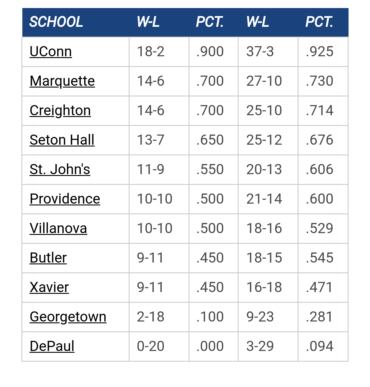
Big East Standings

Recent Posts

Marquette freshmen at Goolsby's 7/12 by Uncle Rico
[Today at 05:05:16 PM]


Recruiting as of 5/15/25 by Juan Anderson's Mixtape
[Today at 03:43:23 PM]


EA Sports College Basketball Is Back by Jay Bee
[Today at 01:23:52 PM]


NM by barfolomew
[Today at 12:15:45 PM]


More conference realignment talk by The Sultan
[Today at 09:03:35 AM]


Marquette NBA Thread by Juan Anderson's Mixtape
[June 30, 2025, 10:49:12 AM]

Please Register - It's FREE!

The absolute only thing required for this FREE registration is a valid e-mail address. We keep all your information confidential and will NEVER give or sell it to anyone else.
Login to get rid of this box (and ads) , or signup NOW!

Next up: A long offseason

Marquette
66
Marquette
Scrimmage
Date/Time: Oct 4, 2025
TV: NA
Schedule for 2024-25
New Mexico
75

cheebs09

Saw Paint Touches retweet this saying our new jerseys leaked. I'm not really a fan. They kind of look like department store knock offs.

https://twitter.com/ejb1333/status/1314926053870231553?s=21

edit: New Jersey called, they want their apostrophe back.

CountryRoads

I think they look pretty good. Wasn't a huge fan of last year's.

Its DJOver

No Al patch, no Beast patch, no American Flag patch, no BLM patch. Not sold that this is legit, no offense PTs.
Scoop motto:
Quote from: ATL MU Warrior on February 06, 2025, 06:04:29 PMthe stats bear that out, but

GooooMarquette

Like the simple solid color on most of the jersey, and love the shoulder stripes.

Not a fan of the lettering or the numbers.

wadesworld

#4
https://www.fanatics.com/college/marquette-golden-eagles/men-jerseys/o-49+t-01973503+ga-56+d-08111290+z-9-2120163658?_ref=p-GALP:m-FD

Interested to see how the other colors look, but these look more like a women team's jersey to me. Liked the old ones better, especially the navy and the championship blues.

cheebs09

Quote from: BLM on October 10, 2020, 10:34:38 AM
https://www.fanatics.com/college/marquette-golden-eagles/men-jerseys/o-49+t-01973503+ga-56+d-08111290+z-9-2120163658?_ref=p-GALP:m-FD

Interested to see how the other colors look, but these look more like a women team's jersey to me. Liked the old ones better, especially the navy and the championship blues.

That was my initial thought. They seemed consistent with what the women's jerseys have looked like the last few years.

Sawsi

Spot on.  Definitely getting women's jersey vibes and I hope that it is the case.

Galway Eagle

Women's jersey for sure. Haven't they been using that cursive lettering or am I crazy?
Retire Terry Rand's jersey!

wadesworld

Have they ever sold men's styles/sizes of women's jerseys before? I can't recall them doing that.

cheebs09

Paint Touches confirming that it's the new Men's jerseys. Hope it's only a one year thing.

Lennys Tap


Warrior Code

I don't hate it, but I am confident we could find 20 designers on twitter who could come up with something better than this in a matter of hours.
Signature:
Signatures are displayed at the bottom of each post or personal message. BBCode and smileys may be used in your signature.

SERocks

Ugh.  Dull.  Boring.  I have not been overly impressed with our jerseys for several years now. 

GoldenWarrior11

It's a big meh for me. No side piping/designs is a huge negative. The shoulders are an interesting twist.  I'm curious if the player names will go above or below the numbers on the back.

I do think this branding is more consistent with our court and logo design. It's nitpicking on my part, but I was always bothered by the recent jerseys having nothing to do with our word marks, logo or branding. In fact, the men's basketball jerseys were completely independent from all other MU program jerseys.  This is closer to our present branding, but still very much isolated, if you will.

Regardless, if you win with a uniform set, they become memorable. If not, they'll like be discarded and forgotten over time that I feel the recent set will be.

Billy Hoyle

#14
Quote from: cheebs09 on October 10, 2020, 09:28:08 AM
Saw Paint Touches retweet this saying our New Jersey's leaked. I'm not really a fan. They kind of look like department store knock offs.

https://twitter.com/ejb1333/status/1314926053870231553?s=21

Definitely. Really not liking the font.

I thought Steve and Barry's went bankrupt...
"Kevin thinks 'mother' is half a word." - Mike Deane

wadesworld

The shorts can make a big difference in my overall opinion on them, and seeing them actually on the players can also change my opinion on them. We'll see.

GB Warrior

Quote from: BLM on October 10, 2020, 12:13:39 PM
The shorts can make a big difference in my overall opinion on them, and seeing them actually on the players can also change my opinion on them. We'll see.

This, but I'm meh so far. Very bland, and so much so that I'd rather the hodge podge of themes of the last kits

DJO's Jaw

I think they're ok. I'd probably really like them if they had some piping on the sides. But as they are now, they're a little plain for my taste.

Lennys Tap

Marquette used to exude edgy and cool. Coolest coach, coolest nickname, coolest unis. Now we exude "meh".

GooooMarquette

Quote from: Lennys Tap on October 10, 2020, 02:47:40 PM
Marquette used to exude edgy and cool. Coolest coach, coolest nickname, coolest unis. Now we exude "meh".


Yep.

We shouldn't change just for the sake of changing. We should only do it to make them better. And this isn't better. I'd rather they just stick with last year's...or the ones from a few seasons earlier, like the Amigos era.

TAMU, Knower of Ball

I like the shoulders,  don't like the font. Waiting for the shorts to finalize opinion
Quote from: Goose on January 15, 2023, 08:43:46 PM
TAMU

I do know, Newsie is right on you knowing ball.


warriorchick

Plus the youngsters can't read cursive.

That'll hurt recruiting.
Have some patience, FFS.

GB Warrior

Looking at these again, I think it's weird that the serif on the number font matches the MU logo, but the Marquette font on the script is now different.

GooooMarquette

Quote from: warriorchick on October 10, 2020, 03:36:12 PM
Plus the youngsters can't read cursive.

That'll hurt recruiting.


Literally lol'd at that one.😂

marqfan22

Quote from: BLM on October 10, 2020, 10:34:38 AM
https://www.fanatics.com/college/marquette-golden-eagles/men-jerseys/o-49+t-01973503+ga-56+d-08111290+z-9-2120163658?_ref=p-GALP:m-FD

Interested to see how the other colors look, but these look more like a women team's jersey to me. Liked the old ones better, especially the navy and the championship blues.

It just seems odd that they would be available to buy on Fanatics before an official release was made.


Previous topic - Next topic