collapse

Resources

2024-2025 SOTG Tally


2024-25 Season SoG Tally
Jones, K.10
Mitchell6
Joplin4
Ross2
Gold1

'23-24 '22-23
'21-22 * '20-21 * '19-20
'18-19 * '17-18 * '16-17
'15-16 * '14-15 * '13-14
'12-13 * '11-12 * '10-11

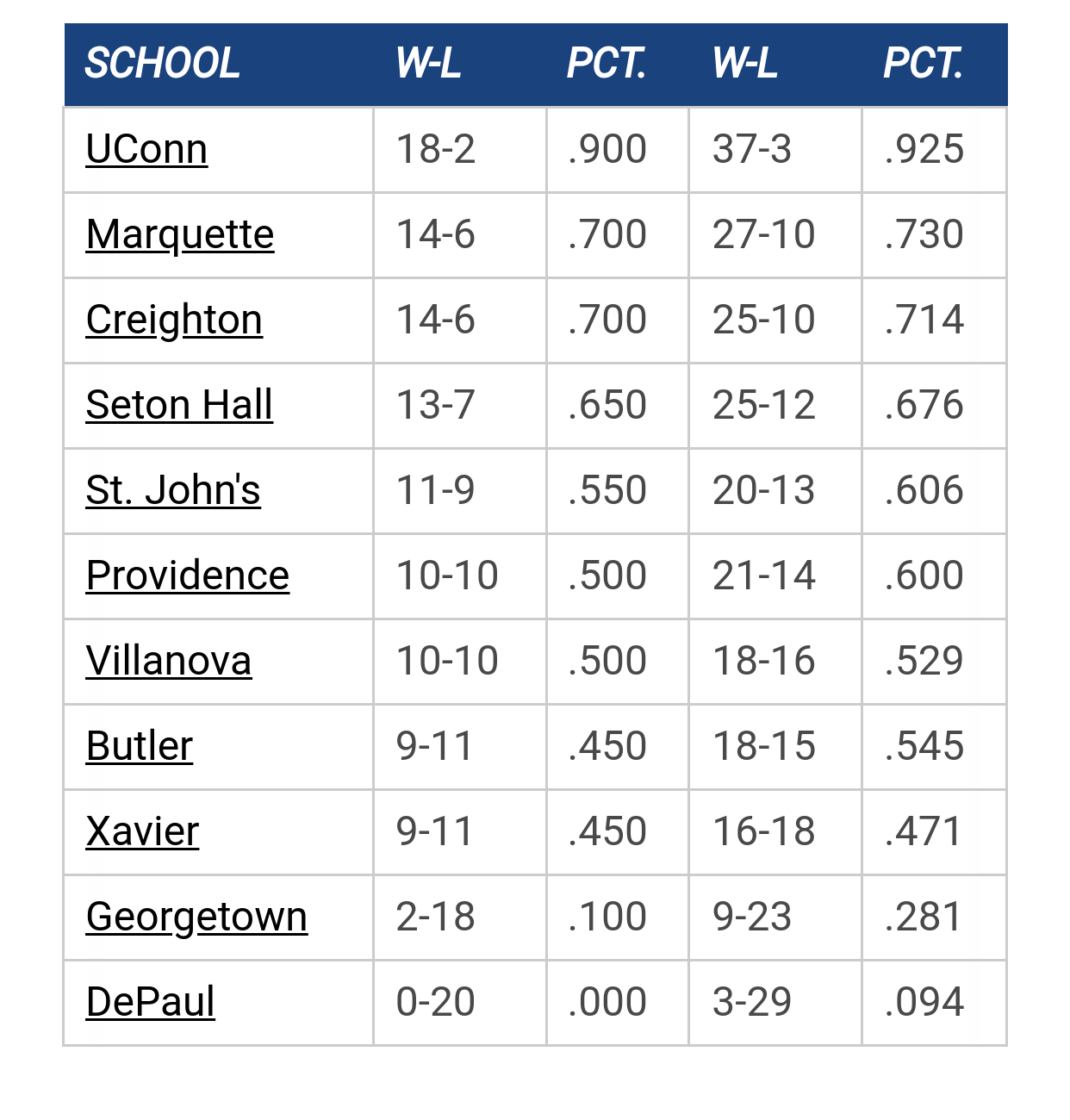
Big East Standings

Recent Posts

Pope Leo XIV by Uncle Rico
[Today at 09:13:00 AM]


Kam update by #UnleashSean
[May 09, 2025, 10:29:30 PM]


Proposed rule changes( coaching challenges) by MU82
[May 09, 2025, 08:33:38 PM]


Ethan Johnston to Marquette by muwarrior69
[May 09, 2025, 05:02:23 PM]


Recruiting as of 4/15/25 by MuMark
[May 09, 2025, 03:09:00 PM]


OT MU adds swimming program by The Sultan
[May 09, 2025, 12:10:04 PM]


2025-26 Schedule by Galway Eagle
[May 08, 2025, 01:47:03 PM]

Please Register - It's FREE!

The absolute only thing required for this FREE registration is a valid e-mail address. We keep all your information confidential and will NEVER give or sell it to anyone else.
Login to get rid of this box (and ads) , or signup NOW!

Next up: A long offseason

Marquette
66
Marquette
Scrimmage
Date/Time: Oct 4, 2025
TV: NA
Schedule for 2024-25
New Mexico
75

warriorchick

Have some patience, FFS.

GooooMarquette

Probably should have gone with the baby blues against Murray State....

🏀

Quote from: GooooMarquette on April 26, 2019, 08:23:45 AM
Probably should have gone with the baby blues against Murray State....

That Joey poster would have looked a lot better


MUHoopsFan2


Warrior Code

I don't know why people hate on the baby/championship/valor blues. I thought they looked great when they were first brought back:


I thought they looked good with the redesign:


and I thought they looked even better this year, with the addition of the subtle yellow stripes:


They're a unique look compared to the navy or white, which a lot of other schools already use.
Signature:
Signatures are displayed at the bottom of each post or personal message. BBCode and smileys may be used in your signature.

Galway Eagle

Quote from: Warrior Code on April 27, 2019, 10:53:21 AM
I don't know why people hate on the baby/championship/valor blues. I thought they looked great when they were first brought back:


I thought they looked good with the redesign:


and I thought they looked even better this year, with the addition of the subtle yellow stripes:


They're a unique look compared to the navy or white, which a lot of other schools already use.

I love em. Agree about the stripes though arent they white? Either way I'd snag a striped one in a heartbeat if they're on sale.
Retire Terry Rand's jersey!

Warrior Code

Quote from: Galway Eagle on April 27, 2019, 11:12:03 AM
I love em. Agree about the stripes though arent they white? Either way I'd snag a striped one in a heartbeat if they're on sale.

I thought they looked yellow on tv but now that you say that, I think they are white. Either way, a good look.
Signature:
Signatures are displayed at the bottom of each post or personal message. BBCode and smileys may be used in your signature.

mu_hilltopper

I think the first times baby blues were worn, people didn't like them, but eventually they've been accepted.

IIRC, in years past at least, one player gets to choose each game's color.  I'm surprised they picked white so often, it's the blandest of the bunch.

warriorchick

Quote from: mu_hilltopper on April 28, 2019, 08:07:28 AM
I think the first times baby blues were worn, people didn't like them, but eventually they've been accepted.

IIRC, in years past at least, one player gets to choose each game's color.  I'm surprised they picked white so often, it's the blandest of the bunch.

I agree.  It looks like underwear.
Have some patience, FFS.

GooooMarquette

The golds have long been my favorites, but this year's striped baby blues were nice.


Warrior Code

Quote from: GooooMarquette on April 28, 2019, 12:48:07 PM
The golds have long been my favorites, but this year's striped baby blues were nice.

I also like the gold. I wouldn't mind seeing them go gold/light blue as the predominant colors with the white and navy becoming the "alternates." Navy and white are way more common as uniform colors, and plus I enjoy a good color-on-color matchup -- the way USC and UCLA do in football every year.
Signature:
Signatures are displayed at the bottom of each post or personal message. BBCode and smileys may be used in your signature.

Johnny B

The whites are just hideous. A white uniform with black text on it. No interesting design at all. So bland and boring. Not to mention the uniform looks like a track uni. Idk why they wore it so much

MUMonster03

Quote from: Warrior Code on April 27, 2019, 10:53:21 AM
I don't know why people hate on the baby/championship/valor blues. I thought they looked great when they were first brought back:


I thought they looked good with the redesign:


and I thought they looked even better this year, with the addition of the subtle yellow stripes:


They're a unique look compared to the navy or white, which a lot of other schools already use.

It almost looks yellow on the sides of the jerseys, but white on the shorts.

Funny thing about the first Valor Blue picture, that was the one they sold at the Spirit Shop but the one on the court always had block "Marquette" letters across the front. Will have to try and find a picture.

Coleman

One year is a small sample size. Would be curious to see this going back 10+ years.

Also it is skewed because the Navy is the only jersey they solely wore on the road.

MUMonster03


Found it, was always strange that the other three had the rounded Marquette.

Warrior Code

Quote from: MUMonster03 on April 29, 2019, 08:44:29 AM


Found it, was always strange that the other three had the rounded Marquette.

You're right, good catch. I actually like this one better.
Signature:
Signatures are displayed at the bottom of each post or personal message. BBCode and smileys may be used in your signature.

Dr. Blackheart

Quote from: MUMonster03 on April 29, 2019, 08:44:29 AM


Found it, was always strange that the other three had the rounded Marquette.

Were these introduced for the 40th anniversary in 2007? Thus, the straight "Marquette" like the tuck outs? DB was after that but they stuck around for a bit. Although the women have the rounded baby blue design.

For the 100th uniforms they moved Marquette to below the number like the tuck outs.

MUMonster03

Quote from: Dr. Blackheart on April 29, 2019, 09:46:46 AM
Were these introduced for the 40th anniversary in 2007? Thus, the straight "Marquette" like the tuck outs? DB was after that but they stuck around for a bit. Although the women have the rounded baby blue design.

For the 100th uniforms they moved Marquette to below the number like the tuck outs.

These were first introduced for the 07-08 season, along with the blue, white, and gold. And then slightly redesigned in 2011 with the elimination of the shoulder patch. I cannot find a single game photo of a baby blue with the curved logo from that time period 2007-16. Even though what you could buy had the curved logo.

I found another photo of Wesley in this design which would of had to of been 2007-08 or 08-09. Always been curious as to why one was different so if anyone has any info. If it was for any anniversary I don't remember them making a big deal out of it.

Dr. Blackheart


frozena pizza

Why didn't we wear the grey unis this year?  I kind of like those.  All time worst was the pink ones we had for a Villanova game a few years ago.

This would be a lot more meaningful if you had a larger sample size and looked at the score variation against the KenPom projected outcome.  Just looking at wins and losses doesn't say much.

Galway Eagle

Quote from: MUMonster03 on April 29, 2019, 08:12:53 AM
It almost looks yellow on the sides of the jerseys, but white on the shorts.

Funny thing about the first Valor Blue picture, that was the one they sold at the Spirit Shop but the one on the court always had block "Marquette" letters across the front. Will have to try and find a picture.

They sold the block letter baby blue when they switched to Jordan from converse.
Retire Terry Rand's jersey!

brewcity77

Quote from: frozena pizza on April 29, 2019, 11:43:13 AMThis would be a lot more meaningful if you had a larger sample size and looked at the score variation against the KenPom projected outcome.  Just looking at wins and losses doesn't say much.

I'm going to guess the laundry color has very little tangible impact on game outcomes or player production. It's only meaningful as a fan talking point.

Previous topic - Next topic