collapse

Resources

2024-2025 SOTG Tally


2024-25 Season SoG Tally
Jones, K.10
Mitchell6
Joplin4
Ross2
Gold1

'23-24 '22-23
'21-22 * '20-21 * '19-20
'18-19 * '17-18 * '16-17
'15-16 * '14-15 * '13-14
'12-13 * '11-12 * '10-11

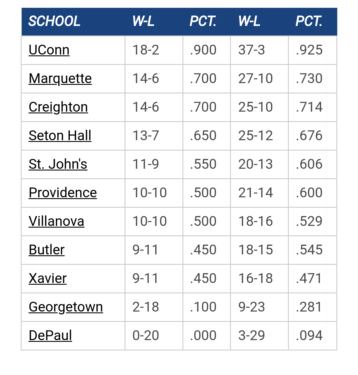
Big East Standings

Recent Posts

Recruiting as of 5/15/25 by MuMark
[Today at 11:47:00 AM]


Congrats to Royce by DoctorV
[May 24, 2025, 10:38:33 PM]


Let's talk about the roster/recruits w/Shaka by Jay Bee
[May 23, 2025, 08:31:14 PM]


Pearson to MU by Juan Anderson's Mixtape
[May 23, 2025, 08:12:08 PM]

Please Register - It's FREE!

The absolute only thing required for this FREE registration is a valid e-mail address. We keep all your information confidential and will NEVER give or sell it to anyone else.
Login to get rid of this box (and ads) , or signup NOW!

Next up: A long offseason

Marquette
66
Marquette
Scrimmage
Date/Time: Oct 4, 2025
TV: NA
Schedule for 2024-25
New Mexico
75

Like the 2016 new uniforms?

5 stars - Fantastic
64 (31.1%)
4 stars
78 (37.9%)
3 stars
40 (19.4%)
2 stars
14 (6.8%)
1 star - Awful
10 (4.9%)

Total Members Voted: 206

Loose Cannon


Quick, cue up "Project Runway"
" Love is Space and Time measured by the Heart. "  M Proust

KampusFoods

Quote from: oldwarrior81 on October 10, 2016, 11:11:27 AM
off topic a bit, but did anyone see the Oregon football jerseys they wore on Saturday?

Navy blue jersey, gold numbers with gold horizontal pinstripes on the sleeves.  Looks like the same designers may have worked on the MU jerseys.


https://cdn3.vox-cdn.com/uploads/chorus_asset/file/7235239/0ee345f7-ddeb-48d0-81ff-42593d5c734b.jpg

And they threw back to their old "webfoots" nickname. Maybe we'll get a warriors jersey, eh?

JamilJaeJamailJrJuan

Quote from: JamilJaeJamailJrJuan on October 06, 2016, 11:22:08 AM
Yuck, I hate it.  No schedule on it!?!

I've been collecting these posters over the past 8 or so years.  Love the collection and love being able to go back and look at the old schedules. 

Hoping there is another one to come. Just a yearbook style photo of each guy from the neck up is super lame.

Super happy to report that there will be another poster released with the players wearing the new jerseys and including the schedule.  Great news, as the Madness poster was super lame if that was going to be the main poster for the year. 
Quote from: Goose on February 09, 2017, 11:06:04 AM
I would take the Rick SLU program right now.

TallTitan34

Updated jersey poster as well.

JamilJaeJamailJrJuan

Quote from: TallTitan34 on October 11, 2016, 09:45:53 AM
Updated jersey poster as well.

Thats a great poster.  DId they give that out at Madness?
Quote from: Goose on February 09, 2017, 11:06:04 AM
I would take the Rick SLU program right now.

TallTitan34

Pulled it off their facebook page.

muwarrior69

Quote from: Buzz Williams' Spillproof Chiclets Cup on October 10, 2016, 08:26:28 AM
Here's my admittedly unpopular opinion.

A for concept.
C- for execution.

The American flag patch is an unnecessary add-on, and further clutters the already-cluttered top half. This is not helped by the fact that the cut on the armholes and neckholes is, as my wife put it, "feminine." It makes the jersey look like a wrestling singlet or a women's bathing suit. In short, it's less space to put more logos. If Marquette make the NCAA Tournament, there will be FIVE different logos/patches on the top half of the jersey.

The fact that there is no white or light blue trim around the numbers and wordmarks, and the font's reduction to a standard block makes the letters and numbers look like iron-ons or cheaply-made practice jerseys, not bespoke "innovation."

I would be all on-board with this redesign if they had retained the side panel stripes. Hell, you could  even keep the sublimated bumblebee, and moved the name below the number and it still would've worked.

But this looks like it was designed by a committee, and the tricolour "belt buckle" just feels tacked on.

After the teaser video, this is a disappointing downgrade.

The flag was added after 9/11 to honor the fallen. Seven families from my parish here in New Jersey lost loved ones in the towers. How soon we forget.

GGGG

Quote from: muwarrior69 on October 11, 2016, 10:42:06 AM
The flag was added after 9/11 to honor the fallen. Seven families from my parish here in New Jersey lost loved ones in the towers. How soon we forget.


No one "forgot" 9/11.  The flag wasn't on the jersey until this year.

Galway Eagle

How soon we forget? You realize the flag wasn't on the jersey three years later and you haven't brought it up till it was put back on now 15 years later. This is such faux passion about this.

Here's Marquette in 2004, no flag.

Retire Terry Rand's jersey!

muwarrior69

Quote from: The Sultan of Sunshine on October 11, 2016, 10:43:21 AM

No one "forgot" 9/11.  The flag wasn't on the jersey until this year.


Then why does it say it was added after 9/11?

warriorchick

Well, technically, it was.  Just not immediately after 9/11.
Have some patience, FFS.

TAMU, Knower of Ball

Quote from: muwarrior69 on October 11, 2016, 10:51:11 AM


Then why does it say it was added after 9/11?

Because it was. And then taken off a season or two later.
Quote from: Goose on January 15, 2023, 08:43:46 PM
TAMU

I do know, Newsie is right on you knowing ball.


GGGG

OK my apologies.  It was placed on, then taken off.  I guess Marquette just remembered that 9/11 occurred again.

muwarrior69

Quote from: BagpipingBoxer on October 11, 2016, 10:49:56 AM
How soon we forget? You realize the flag wasn't on the jersey three years later and you haven't brought it up till it was put back on now 15 years later. This is such faux passion about this.

Here's Marquette in 2004, no flag.


Obviously it was put back on to remember 9/11 and does serve a purpose and was not just put there for no reason as many have suggested.

Galway Eagle

Quote from: muwarrior69 on October 11, 2016, 11:02:49 AM
Obviously it was put back on to remember 9/11 and does serve a purpose and was not just put there for no reason as many have suggested.

Ok, was 9/11 in Milwaukee? Because even St John's, Fordham, Columbia, LIU Brooklyn, Manhatten, St Francis and Wagner who are all actually in the city don't have the patch.

How many MU alumni died in this horrible tragedy? (I honestly don't know, what this ever researched?)

I'd stake my life that the reason it was put there is because they needed an element from a very basic jersey that was in the FF and they figured it was something simple enough that nobody would get upset about rather than an actual 9/11 remembrance 15 years later.
Retire Terry Rand's jersey!

GGGG

Quote from: BagpipingBoxer on October 11, 2016, 11:12:45 AM
Ok, was 9/11 in Milwaukee? Because even St John's, Fordham, Columbia, LIU Brooklyn, Manhatten, St Francis and Wagner who are all actually in the city don't have the patch.

How many MU alumni died in this horrible tragedy? (I honestly don't know, what this ever researched?)

I'd stake my life that the reason it was put there is because they needed an element from a very basic jersey that was in the FF and they figured it was something simple enough that nobody would get upset about rather than an actual 9/11 remembrance 15 years later.


Well the "AL" patch was around in 2003 as well and is referenced on the graphic as such.

I don't mind the flag.  I just mind the idea that if you don't have one, it means we somehow "forgot" 9/11 or even minimized its impact on our country.  It's just a basketball jersey.

Warrior Code

Quote from: The Sultan of Sunshine on October 11, 2016, 11:16:17 AM

Well the "AL" patch was around in 2003 as well and is referenced on the graphic as such.

I don't mind the flag.  I just mind the idea that if you don't have one, it means we somehow "forgot" 9/11 or even minimized its impact on our country.  It's just a basketball jersey.

Agreed.
Signature:
Signatures are displayed at the bottom of each post or personal message. BBCode and smileys may be used in your signature.

Mobot

I voted 4 stars.  I'd give it 5 stars if they dropped the belt (see the poster).

TSmith34, Inc.

Quote from: Mobot on October 11, 2016, 11:32:23 AM
I voted 4 stars.  I'd give it 5 stars if they dropped the belt (see the poster).

I think (ok, hope) the belt will look better with the other uniform colors.  Definitely the one element that to me looks like it was just tacked on.
If you think for one second that I am comparing the USA to China you have bumped your hard.

BrewCity83

I can't wait to see the other three colors.  Love the navy ones!  I heard the four different colored versions were all supposed to be unveiled at Madness but Nike didn't deliver them in time.  These will look really cool on the court.
The shaka sign, sometimes known as "hang loose", is a gesture of friendly intent often associated with Hawaii and surf culture.

warriorchick

Quote from: TSmith34 on October 11, 2016, 12:01:09 PM
I think (ok, hope) the belt will look better with the other uniform colors.  Definitely the one element that to me looks like it was just tacked on.

To be honest, I did not even notice the belt when I saw the uniforms in person last Friday. It's not a big deal.  It's not like they are championship wrestlers or something.
Have some patience, FFS.

StillAWarrior

Quote from: warriorchick on October 11, 2016, 12:38:36 PM
To be honest, I did not even notice the belt when I saw the uniforms in person last Friday. It's not a big deal.  It's not like they are championship wrestlers or something.

I had a similar experience with all the elements at the top (although I haven't seen them in person).  I guess that when I look at the uniforms, my mind kind of filters out that stuff -- kind of how I don't even notice ads on webpages (when I'm not using a blocker).  When I actively look at it, I'd agree that it's a little cluttered and would be more aesthetically pleasing to me if the flag were moved off the front of the jersey (or eliminated completely) and the Big East/Jumpman were moved up a little (similar to the placement on the 2015 jersey).  But unless I'm specifically looking at those elements, I don't really notice them.
Never wrestle with a pig.  You both get dirty, and the pig likes it.

Warrior Code

I doubt they would do it this way, but I think it would have been cool to see a different design for each color. The navy could be the bumblebees, the light blue could be similar to what we just had, the whites could have the circle around the numbers and the yellow could have some other design cue from our past (camo sides?). I would have been down with that idea.
Signature:
Signatures are displayed at the bottom of each post or personal message. BBCode and smileys may be used in your signature.

Bocephys

Quote from: warriorchick on October 11, 2016, 12:38:36 PM
To be honest, I did not even notice the belt when I saw the uniforms in person last Friday. It's not a big deal.  It's not like they are championship wrestlers or something.

Maybe that's the complaint, it should be more like a wrestling championship belt.

Johnny B

These are ugly and look like track/swimsuit unis... wtf

Previous topic - Next topic