Main Menu
collapse

Resources

2024-2025 SOTG Tally


2024-25 Season SoG Tally
Jones, K.10
Mitchell6
Joplin4
Ross2
Gold1

'23-24 '22-23
'21-22 * '20-21 * '19-20
'18-19 * '17-18 * '16-17
'15-16 * '14-15 * '13-14
'12-13 * '11-12 * '10-11

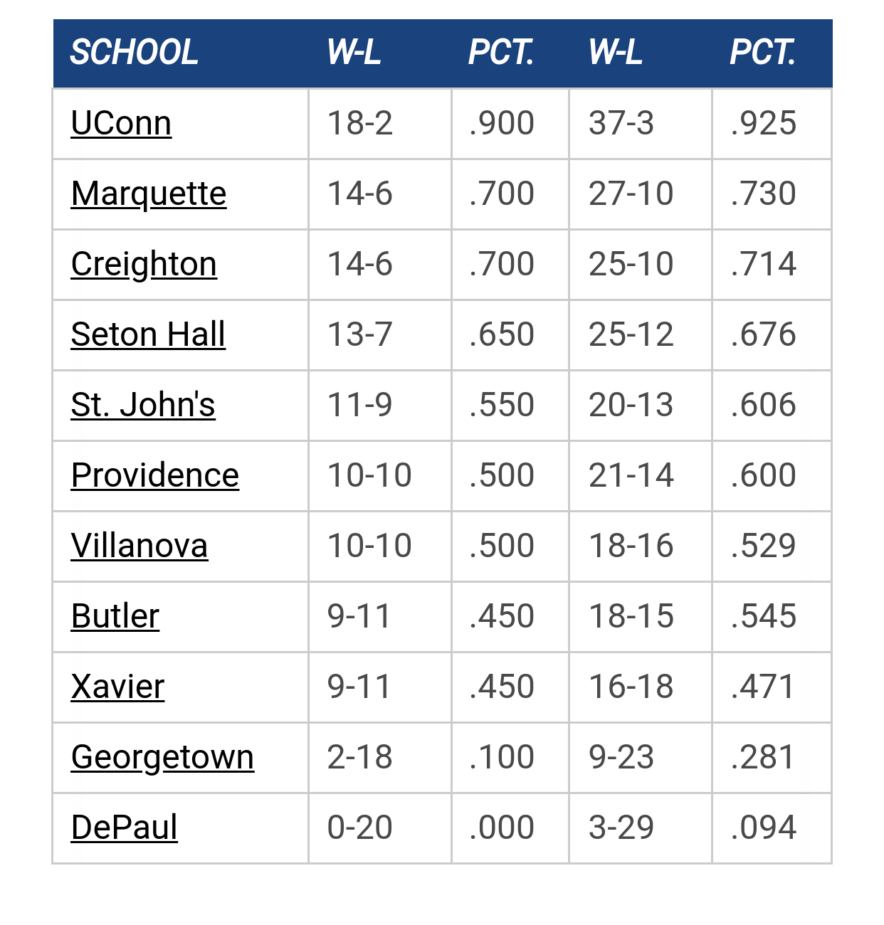
Big East Standings

Recent Posts

More conference realignment talk by DFW HOYA
[July 03, 2025, 07:58:45 PM]


Recruiting as of 5/15/25 by Jay Bee
[July 03, 2025, 07:54:19 PM]


Marquette freshmen at Goolsby's 7/12 by MU Fan in Connecticut
[July 03, 2025, 04:04:32 PM]


EA Sports College Basketball Is Back by Jay Bee
[July 02, 2025, 11:35:01 AM]

Please Register - It's FREE!

The absolute only thing required for this FREE registration is a valid e-mail address. We keep all your information confidential and will NEVER give or sell it to anyone else.
Login to get rid of this box (and ads) , or signup NOW!

Next up: A long offseason

Marquette
66
Marquette
Scrimmage
Date/Time: Oct 4, 2025
TV: NA
Schedule for 2024-25
New Mexico
75

Ellenson Guerrero

"What we take for-granted, others pray for..." - Brent Williams 3/30/14

MU Fan in Connecticut

They should have made it look like ACC logo..........

Hards Alumni

Awful.  Looks like it could be a logo for an expansion IFL team from Austin... The Austin Lonestars!

Why not stay classic?

MerrittsMustache

Looks like a logo from a low-major school that made the tourney as a 15-seed.


MileHigh

It looks like a comic book hero's symbol.

🏀

Wow, that's bad.

A blue triangle with a stretched out star that looks like it is from Super Mario Galaxy.

GGGG

Somewhat ironic that the AAC would create a logo that looks about 25 years out of date.

GGGG

http://deadspin.com/the-american-athletic-conference-reveals-its-logo-510454056

"The American logo looks like the Arizona Wildcats logo drank a Heineken."

THRILLHO

I have no strong feelings about this logo one way or another.

Groin_pull

Right, because the Big East's logo is so amazing.::)

GGGG

Quote from: Groin_pull on May 30, 2013, 10:58:44 AM
Right, because the Big East's logo is so amazing.::)


It's simple and clean.  That's how logos should look.

reinko

Quote from: Terror Skink on May 30, 2013, 11:00:12 AM

It's simple and clean.  That's how logos should look.

Exactly.


StillAWarrior

Quote from: Terror Skink on May 30, 2013, 10:34:16 AM
http://deadspin.com/the-american-athletic-conference-reveals-its-logo-510454056

"The American logo looks like the Arizona Wildcats logo drank a Heineken."


I also liked this comment:  "The American will officially launch on July 1, but their bare-bones website already makes a bold statement. "Strong. Stable. United. Competitive." Maybe one of those descriptors is accurate, and even that's debatable."
Never wrestle with a pig.  You both get dirty, and the pig likes it.

bradley center bat

Logo looks great! This league in basketball could get as many as 6 teams in the ncaa tourney. Winning will stop the jokes.

Groin_pull

Let's be honest. This board would have ripped apart any name or logo they came up with.

MerrittsMustache

Quote from: Groin_pull on May 30, 2013, 11:57:29 AM
Let's be honest. This board would have ripped apart any name or logo they came up with.

Unless they were the Warrior Conference and used Willie Wampum as the logo.


warriorchick

Let's hope none of the teams have a clothing deal with Starter.


Have some patience, FFS.

MU Fan in Connecticut

Since they are essentally CUSA.2, at least they kept the star from the CUSA logo.

AlumKCof93

Haven't seen the Pelicans logo until now.  Kinda like it.
"Yes, Dinnertime!  The perfect break between work and drunk" - Homer J. Simpson

Lacrosse218

Quote from: AlumKCof93 on May 30, 2013, 12:30:16 PM
Haven't seen the Pelicans logo until now.  Kinda like it.

The Pelicans logo reminds me of the Anhesuer Busch logo.

keefe

Terror put is best - this is somewhat dated and has a definite '80's feel to it. Frankly, they might have done better as this really only conveys "American" but if they are looking to solidify that word then it is effective. I am sure they got a lot of positive associations in focus and panel from the colors and the star. At this point that may be all they were hoping for since everything said about them thus far has been critical and negative.


Death on call

MUMonster03

Quote from: reinko on May 30, 2013, 11:02:00 AM
Exactly.


That isn't even one of the official logos, probably just some fan design. The actual Pelican logos are all in this article.

http://nba.si.com/2013/01/24/new-orleans-pelicans-logo-hornets/

reinko

Quote from: MUMonster03 on May 30, 2013, 12:51:33 PM
That isn't even one of the official logos, probably just some fan design. The actual Pelican logos are all in this article.

http://nba.si.com/2013/01/24/new-orleans-pelicans-logo-hornets/

I like the one I found.

Sunbelt15

Quote from: reinko on May 30, 2013, 11:02:00 AM
Exactly.


There is no way you can make a pelican look tough. They always look hungry.

Hards Alumni

Quote from: MUMonster03 on May 30, 2013, 12:51:33 PM
That isn't even one of the official logos, probably just some fan design. The actual Pelican logos are all in this article.

http://nba.si.com/2013/01/24/new-orleans-pelicans-logo-hornets/

Lemme help you out...


Previous topic - Next topic