collapse

Resources

2024-2025 SOTG Tally


2024-25 Season SoG Tally
Jones, K.10
Mitchell6
Joplin4
Ross2
Gold1

'23-24 '22-23
'21-22 * '20-21 * '19-20
'18-19 * '17-18 * '16-17
'15-16 * '14-15 * '13-14
'12-13 * '11-12 * '10-11

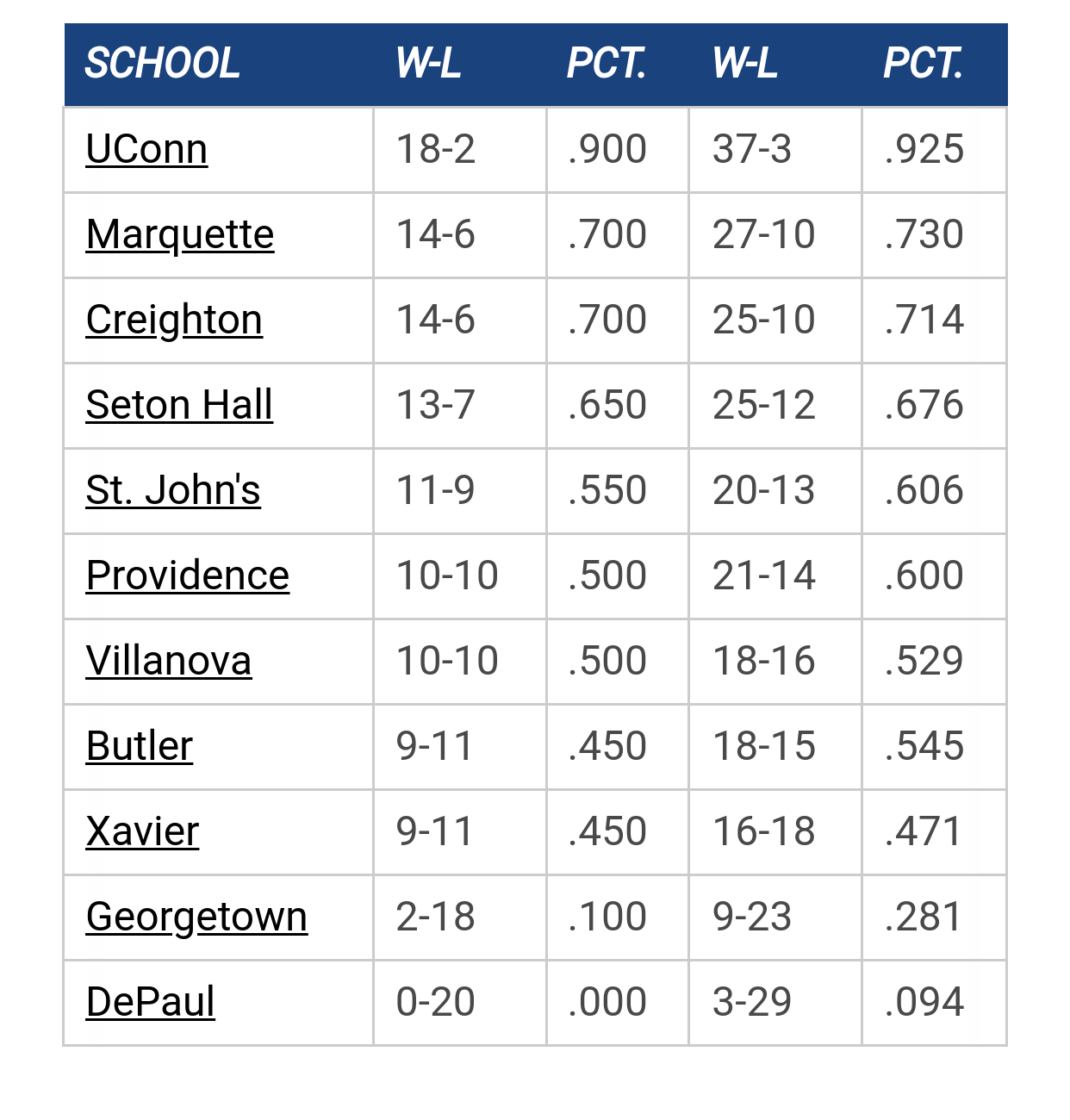
Big East Standings

Recent Posts

Recruiting as of 5/15/25 by wadesworld
[Today at 10:47:55 AM]


25 YEARS OF THE AP TOP 25 by Jay Bee
[Today at 10:37:13 AM]


2025-26 Schedule by cheebs09
[Today at 10:12:32 AM]


Marquette NBA Thread by Billy Hoyle
[July 04, 2025, 09:32:02 PM]


More conference realignment talk by DFW HOYA
[July 03, 2025, 07:58:45 PM]


Marquette freshmen at Goolsby's 7/12 by MU Fan in Connecticut
[July 03, 2025, 04:04:32 PM]

Please Register - It's FREE!

The absolute only thing required for this FREE registration is a valid e-mail address. We keep all your information confidential and will NEVER give or sell it to anyone else.
Login to get rid of this box (and ads) , or signup NOW!

Next up: A long offseason

Marquette
66
Marquette
Scrimmage
Date/Time: Oct 4, 2025
TV: NA
Schedule for 2024-25
New Mexico
75

Chili

But I like to throw handfuls...

Mobot

#1
It's awesome to be one of only four schools to be part of the Jordan brand.

Maybe it is just the lighting or camera angle but I think that Marquette's logo looks a bit sloppy compared to the other three.  

That being said, I am confident that the shoe will look pretty sweet once we see it on the court.

*Edited to incorporate the sandwich technique*

Markusquette

I wouldn't say "sloppy," but it isn't as well defined since the letters appear to be outlined by the gold/navy rather than filled in with a color.

WellsstreetWanderer

Can't believe they couldn't have done better with the MU  logo

Dawson Rental

I think that Marquette has got the most intricate logo, it uses the shoe's material, as well as thread.  Georgetown's logo looks the most plain vanilla to me.
You actually have a degree from Marquette?

Quote from: muguru
No...and after reading many many psosts from people on this board that do...I have to say I'm MUCH better off, if this is the type of "intelligence" a degree from MU gets you. It sure is on full display I will say that.

NCAARules

Quote from: LittleMurs on October 23, 2011, 05:31:02 PM
I think that Marquette has got the most intricate logo, it uses the shoe's material, as well as thread.  Georgetown's logo looks the most plain vanilla to me.

Completely agree. Looks like the logo was limited to two-colors for the threading. Also, the glare on that photo may be misleading as to how it will look in use.

I will say this, if that is how it looks on the court, I'll be disappointed. (but I really expect i to look better in person).

Markusquette

Quote from: NCAARules on October 23, 2011, 06:03:36 PM
Completely agree. Looks like the logo was limited to two-colors for the threading. Also, the glare on that photo may be misleading as to how it will look in use.

I will say this, if that is how it looks on the court, I'll be disappointed. (but I really expect i to look better in person).

Thankfully, the look of our logo on their shoes is the least of my worries on court :)

RyanConroy

I actually like the MU logo the most out of the four on those shoes. Very distinctive.

GGGG

Quote from: elephantraker on October 23, 2011, 04:51:35 PM
Can't believe they couldn't have done better with the MU  logo

Proof that some people will find anything to complain about....

PuertoRicanNightmare

The tiny little hands that construct those shoes are doing a sh*tty job!

A little less porridge and a little more work are in order.

ZiggysFryBoy

Quote from: PuertoRicanNightmare on October 23, 2011, 08:06:40 PM
The tiny little hands that construct those shoes are doing a sh*tty job!

A little less porridge and a little more work are in order.

they need to stand too, sitting makes them sloppy.

Previous topic - Next topic