Main Menu
collapse

Resources

2024-2025 SOTG Tally


2024-25 Season SoG Tally
Jones, K.10
Mitchell6
Joplin4
Ross2
Gold1

'23-24 '22-23
'21-22 * '20-21 * '19-20
'18-19 * '17-18 * '16-17
'15-16 * '14-15 * '13-14
'12-13 * '11-12 * '10-11

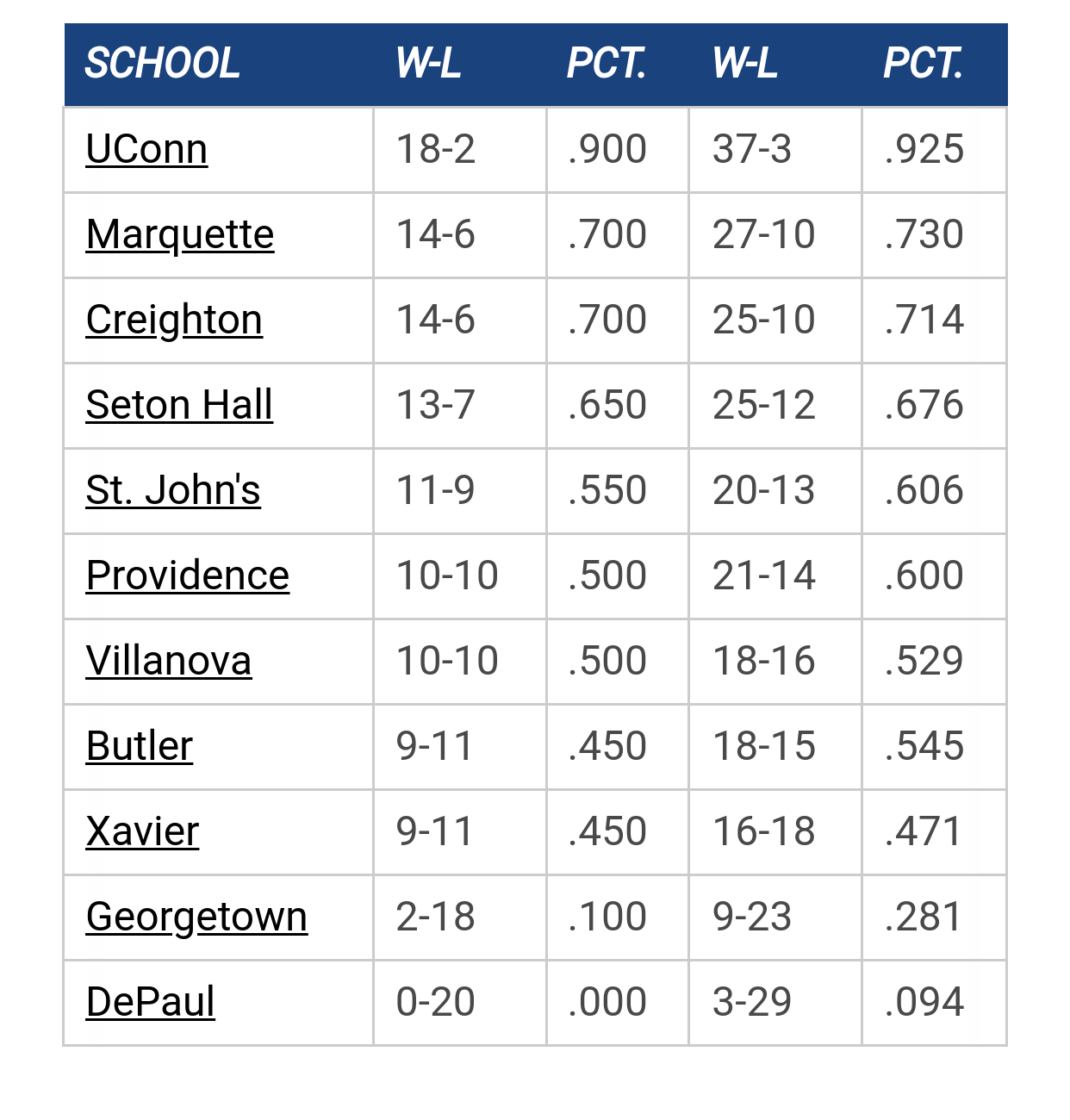
Big East Standings

Recent Posts

2025-26 Schedule by ChuckyChip
[September 12, 2025, 03:48:51 PM]


Any Updates On Men's Basketball Practice Facility Funding? by TedBaxter
[September 12, 2025, 03:22:21 PM]

Please Register - It's FREE!

The absolute only thing required for this FREE registration is a valid e-mail address. We keep all your information confidential and will NEVER give or sell it to anyone else.
Login to get rid of this box (and ads) , or signup NOW!

Next up: A long offseason

Marquette
66
Marquette
Scrimmage
Date/Time: Oct 4, 2025
TV: NA
Schedule for 2024-25
New Mexico
75

lab_warrior

F*** black uniforms.  I can't think of anything more bush-league, community college, and amateur looking; well, aside from those putrid Atl. Hawks jerseys above.  I like the current school colors only uni-scheme.     

g0warriors1


TheDOC816


WildBill77RT

From UniWatch:

Ryan Mandel think Nike may have inadvertently leaked Marquette's new hoops uni: "I was looking on the niketeam.com website where you can customize Nike jerseys and noticed a new Marquette design. When you click on the jersey to customize (click on "Modified Basketball" and then "Team ID Plus Jersey" and you can click on the jerseys and preview them), it shows four options for the jersey, three of which were already customized as a Marquette jersey in white, navy, and yellow."

Pretty similar, but interesting number font....
\\\oo///

JWags85

http://www.niketeam.com/V2/new/builders/teamid/index.asp?&ref=

Looks like they cleaned them up a bit and took the stripes off the shoulders.  It also looks like they are the tighter tops that Nike has been using.  The shorts are a bit different too.

reinko

#130
Quote from: JWags85 on April 11, 2011, 10:01:45 AM
http://www.niketeam.com/V2/new/builders/teamid/index.asp?&ref=

Looks like they cleaned them up a bit and took the stripes off the shoulders.  It also looks like they are the tighter tops that Nike has been using.  The shorts are a bit different too.

Works now.

reinko

#131
can only use screen grabs


GGGG

Link worked for me.  

The lettering isn't the "bubble lettering" we have seen.  Much cleaner font with gold lettering (but blue numbers) on the white jersey.  White numbers on the navy and gold jerseys with gold and navy letters respectively.  They also have a unique navy trim on the bottom of the shorts.

I like them.  They combine the best of the former, such as the multi-colors down the side, with the look of Nike.

I bet there will be a light blue alternate with gold lettering...very nice.

🏀


rocky_warrior

Quote from: reinko on April 11, 2011, 10:08:18 AM
can only use screen grabs

Hah, I did the same with the ones they had, thanks for customizing the baby blue...

🏀


Here's an actual picture.

drewm88

Not awful, but could be better. I don't like the the varying stripe length on the shorts or the bottom of the shorts. And I'd prefer the stripes go all the way around the collar.

WildBill77RT

I do hope the bottom of the shorts have the MU logo, rather than a generic M.  Other than that, I like them.
\\\oo///

🏀

Not a big fan of the numeric font they used.

TallTitan34

I am ok with the number font.  I am unsure about the MARQUETTE font however.  I like the font that looks like the warrior logo font.  I dislike the other.

Litehouse

I don't like the navy wave at the bottom of the shorts, it just looks totally out of place.  Otherwise, I think it's acceptable, a decent update on the old ones, without losing the overall feel.  Plus, they got rid of the stripes on the shoulders, which I didn't like on the old ones.

🏀

They also don't show the AL emblem.

lab_warrior

They're not bad, agree about the number font, and the shorts logo, but most of the key elements that make our unis awesome are there.  And no black uniforms, either, so that's good. 

🏀

Quote from: lab_warrior on April 11, 2011, 10:47:22 AM
They're not bad, agree about the number font, and the shorts logo, but most of the key elements that make our unis awesome are there.  And no black uniforms, either, so that's good. 


TallTitan34

Quote from: Litehouse on April 11, 2011, 10:34:06 AM
Plus, they got rid of the stripes on the shoulders, which I didn't like on the old ones.

Agreed.  I was never a fan of those.

GGGG

Quote from: lab_warrior on April 11, 2011, 10:47:22 AM
They're not bad, agree about the number font, and the shorts logo, but most of the key elements that make our unis awesome are there.  And no black uniforms, either, so that's good.  


You are looking too much into this.  These may or may not actually be the new uniforms.  And anyway it is just a template they use for design purposes.  There could be a black.  There could be a light blue.  And there is still plenty of room for "AL" lettering.

Litehouse

There better not be black unis.  If there are, I will be seriously embarrassed for MU.

MUfan12

Quote from: The Sultan of South Wayne on April 11, 2011, 10:55:47 AM
You are looking too much into this.  These may or may not actually be the new uniforms.  And anyway it is just a template they use for design purposes.  There could be a black.  There could be a light blue.  And there is still plenty of room for "AL" lettering.

Exactly. If you go into the other screens, the lettering is just one of the stock fonts. I do hope there's no wave thing on the bottom of the shorts though. Would love to see them go clean with it.

Skatastrophy

Similar to Oregon's numbering:


TallTitan34

Quote from: Litehouse on April 11, 2011, 11:04:59 AM
There better not be black unis.  If there are, I will be seriously embarrassed for MU.

While I'm not a fan of black jerseys, I wouldn't be embarassed if they wore them.  Why would you be embarassed?

Previous topic - Next topic