Main Menu
collapse

Resources

25-26 SOTG Tally

2025-26 Season SoG Tally
Ross6
James Jr4
Parham1
Stevens1

'24-25 * '23-24 * '22-23
'21-22 * '20-21 * '19-20
'18-19 * '17-18 * '16-17
'15-16 * '14-15 * '13-14
'12-13 * '11-12 * '10-11

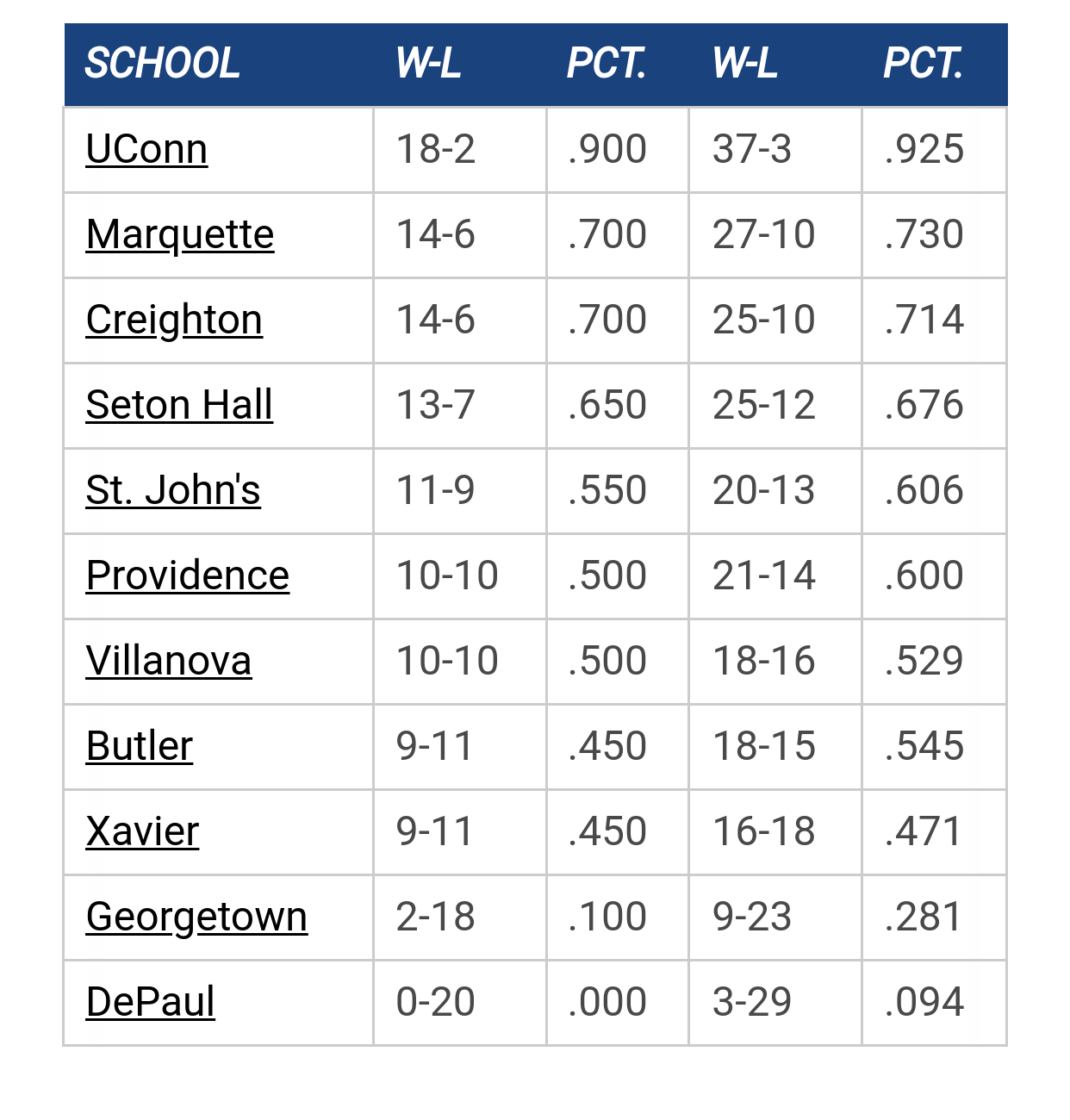
Big East Standings

Recent Posts

‘26-27 Schedule by MU82
[September 08, 2026, 07:34:53 PM]


Philipe Ndong to Marquette by Uncle Rico
[September 08, 2026, 06:36:58 PM]


More conference realignment talk by Jay Bee
[September 08, 2026, 04:02:36 PM]


Porter minutes 2026-2026 by WarriorFan
[September 06, 2026, 09:27:04 AM]


1977 Championship 50th Anniversary (New Uniform) by romey
[September 06, 2026, 09:13:41 AM]

Please Register - It's FREE!

The absolute only thing required for this FREE registration is a valid e-mail address. We keep all your information confidential and will NEVER give or sell it to anyone else.
Login to get rid of this box (and ads) , or signup NOW!

Next up:  @ Green Bay (Exhibition)

Marquette
Marquette @
Green Bay (Ex)
Date/Time: Oct 19, 2026
TV: NA
Schedule for 2026-27
12 - 20

Mu8891

I agree.  The " new " MU ( sign on campus and social media ) is bad.

It looks cartoonish, and perfect for a playground. 

And, some of their other branding could use an update.

Shooter McGavin

Quote from: The Sultan of Semantics on August 30, 2023, 03:32:34 PM


I'm not saying it's broken, but this is pretty meh. Marquette Hall isn't some instantly recognizable structure, and its a pretty busy image.  Most logos are more clean and simple these days.

For instance, each of these are pretty simple.  Creighton and Georgetown just use words. Xavier uses their athletic marks and fonts, which is pretty rare, but works in this case.

https://www.creighton.edu/

https://www.georgetown.edu/

https://www.xavier.edu/

Agreed it is a little busy.  Taking the be the difference slogan off would be a good thing.  The rest of it I'm ok with.  And our athletic logo is fine.  Doesn't need Marquette spelled out on a banner anymore in my opinion.  It has been around long enough.  People who watch colleg basketball know the logo by now without having to spell out Marquette.
TRGV

Daniel

Quote from: Shooter McGavin on August 30, 2023, 05:29:18 PM
Agreed it is a little busy.  Taking the be the difference slogan off would be a good thing.  The rest of it I'm ok with.  And our athletic logo is fine.  Doesn't need Marquette spelled out on a banner anymore in my opinion.  It has been around long enough.  People who watch colleg basketball know the logo by now without having to spell out Marquette.

Yeah I think using a square and filling it in is real old school.   Not clean and crisp.   Needs a redo

MU82

There is one and only one truly great marketing idea - $10 lower-bowl tickets for Scoopers.

Only requirement is that we stand and cheer at the appropriate times. In other words, no sweater vests allowed.
"It's not how white men fight." - Tucker Carlson

"Guard against the impostures of pretended patriotism." - George Washington

"In a time of deceit, telling the truth is a revolutionary act." - George Orwell

tower912

They might have to fence the scoopers in.   Picture the cowboy bar scene in Blues Brothers.
...I'm a rebel just for kicks,  now
I been feeling it since 1966, now...

Coleman

#180
Quote from: The Sultan of Semantics on August 30, 2023, 03:32:34 PM


I'm not saying it's broken, but this is pretty meh. Marquette Hall isn't some instantly recognizable structure, and its a pretty busy image.  Most logos are more clean and simple these days.

For instance, each of these are pretty simple.  Creighton and Georgetown just use words. Xavier uses their athletic marks and fonts, which is pretty rare, but works in this case.

https://www.creighton.edu/

https://www.georgetown.edu/

https://www.xavier.edu/

I agree. The Be The Difference thing is old and tired. They were using it 20 years ago when I enrolled.

I'm neutral on the Marquette Hall piece of the logo. I agree its nothing amazing, but until I see a better replacement I'm ok with it. Maybe if they stylized it to make it a little bit less busy?

warriorchick

Quote from: Coleman on August 31, 2023, 11:28:32 AM
I agree. The Be The Difference thing is old and tired. They were using it 20 years ago when I enrolled.

I'm neutral on the Marquette Hall piece of the logo. I agree its nothing amazing, but until I see a better replacement I'm ok with it. Maybe if they stylized it to make it a little bit less busy?

My main beef of this logo is that the letters are too small for signage use. This is what they use for the exit coming in on 90 from the south, and you can't even read it.
Have some patience, FFS.

Previous topic - Next topic