Main Menu
collapse

Resources

2024-2025 SOTG Tally


2024-25 Season SoG Tally
Jones, K.10
Mitchell6
Joplin4
Ross2
Gold1

'23-24 '22-23
'21-22 * '20-21 * '19-20
'18-19 * '17-18 * '16-17
'15-16 * '14-15 * '13-14
'12-13 * '11-12 * '10-11

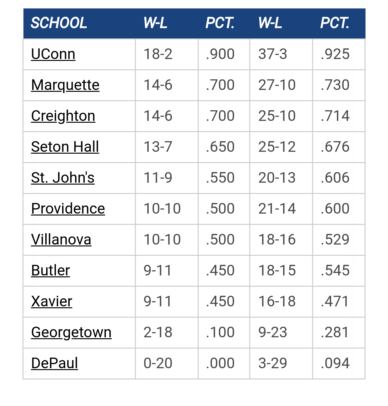
Big East Standings

Recent Posts

Marquette freshmen at Goolsby's 7/12 by Jay Bee
[Today at 03:25:54 PM]


EA Sports College Basketball Is Back by Jay Bee
[Today at 03:25:05 PM]


Marquette NBA Thread by MU82
[Today at 03:17:44 PM]


Recruiting as of 7/15/25 by The Sultan
[Today at 12:24:00 PM]


More conference realignment talk by The Sultan
[July 14, 2025, 09:19:32 AM]


Nash Walker commits to MU by Juan Anderson's Mixtape
[July 14, 2025, 09:16:16 AM]


Pearson to MU by Juan Anderson's Mixtape
[July 13, 2025, 09:51:20 AM]

Please Register - It's FREE!

The absolute only thing required for this FREE registration is a valid e-mail address. We keep all your information confidential and will NEVER give or sell it to anyone else.
Login to get rid of this box (and ads) , or signup NOW!

Next up: A long offseason

Marquette
66
Marquette
Scrimmage
Date/Time: Oct 4, 2025
TV: NA
Schedule for 2024-25
New Mexico
75

rgoode57

Any word on when the team gets new uniforms. The current unis were ok when first introduced but are starting to look dated. It is not a design meant to be long-lasting. I have no idea what the timeframes are for new togs, but I fear the current uniforms will be in place another year or two.

MUbiz


MU82

Good. I hope that includes dumping the font.

I'm not outraged by it or anything, and I acknowledge that it's a matter of personal opinion. But I never loved the script Marquette and I think it's definitely time for something new.
"It's not how white men fight." - Tucker Carlson

"Guard against the impostures of pretended patriotism." - George Washington

"In a time of deceit, telling the truth is a revolutionary act." - George Orwell

tower912

Luke 6:45   ...A good man produces goodness from the good in his heart; an evil man produces evil out of his store of evil.   Each man speaks from his heart's abundance...

It is better to be fearless and cheerful than cheerless and fearful.

StillAWarrior

Quote from: MU82 on August 12, 2024, 10:37:24 AM
Good. I hope that includes dumping the font.

I'm not outraged by it or anything, and I acknowledge that it's a matter of personal opinion. But I never loved the script Marquette and I think it's definitely time for something new.

Love the script.
Never wrestle with a pig.  You both get dirty, and the pig likes it.

Viper

Quote from: StillAWarrior on August 12, 2024, 11:14:33 AM
Love the script.
yes!...maybe script home/block road, or vice versa. Im probably minority here, but do wish 'AL' was in a spot  other than the relegated to waistband of the past couple seasons.
Support CBP 🇺🇸


TSmith34, Inc.

If you think for one second that I am comparing the USA to China you have bumped your hard.

tower912

Grays with the navy blue, gold, and championship blue piping.   Then sell that to the fans.   Quarterzips, decent wicking polos, wide brimmed bucket hats.
Luke 6:45   ...A good man produces goodness from the good in his heart; an evil man produces evil out of his store of evil.   Each man speaks from his heart's abundance...

It is better to be fearless and cheerful than cheerless and fearful.

Galway Eagle

I think we should take some inspiration from the Brazilian women's volleyball team and add collars to our jerseys. I've often wondered how we could make it so basketball jerseys could become golf attire and this is the chance!
Retire Terry Rand's jersey!

tower912

Or some European futbol jerseys.
Luke 6:45   ...A good man produces goodness from the good in his heart; an evil man produces evil out of his store of evil.   Each man speaks from his heart's abundance...

It is better to be fearless and cheerful than cheerless and fearful.

LloydsLegs

Quote from: Galway Eagle on August 12, 2024, 12:10:07 PM
I think we should take some inspiration from the Brazilian women's volleyball team and add collars to our jerseys. I've often wondered how we could make it so basketball jerseys could become golf attire and this is the chance!

https://x.com/whitesox/status/634449588972355584/photo/1

Sox '76

TallTitan34

The 2011-16 jerseys will always be my favorite. Keep the word mark if you have to.


CTWarrior

Quote from: MU82 on August 12, 2024, 10:37:24 AM
Good. I hope that includes dumping the font.

I'm not outraged by it or anything, and I acknowledge that it's a matter of personal opinion. But I never loved the script Marquette and I think it's definitely time for something new.
Agree with this, current font for Marquette and numbers look cheap, like they're ironed on or something.  Otherwise, I like the current uniforms.
Calvin:  I'm a genius.  But I'm a misunderstood genius. 
Hobbes:  What's misunderstood about you?
Calvin:  Nobody thinks I'm a genius.

MU82

Quote from: StillAWarrior on August 12, 2024, 11:14:33 AM
Love the script.

As I said it's a matter of personal opinion. And yours is entitled to be wrong! 😎
"It's not how white men fight." - Tucker Carlson

"Guard against the impostures of pretended patriotism." - George Washington

"In a time of deceit, telling the truth is a revolutionary act." - George Orwell

StillAWarrior

Quote from: Galway Eagle on August 12, 2024, 12:10:07 PM
I think we should take some inspiration from the Brazilian women's volleyball team and add collars to our jerseys. I've often wondered how we could make it so basketball jerseys could become golf attire and this is the chance!

I have a vague recollection of Evansville having collars in the late 80s or early 90s, but maybe it was just short sleeves without collars.
Never wrestle with a pig.  You both get dirty, and the pig likes it.

GoldenWarrior11

Quote from: TallTitan34 on August 12, 2024, 12:25:46 PM
The 2011-16 jerseys will always be my favorite. Keep the word mark if you have to.


My favorite as well.  If they did a hybrid with the current set, I think it would be incredible. 

muwarrior69

Quote from: StillAWarrior on August 12, 2024, 11:14:33 AM
Love the script.

Quote from: MU82 on August 12, 2024, 12:52:29 PM
As I said it's a matter of personal opinion. And yours is entitled to be wrong! 😎

How about courier?

Billy Hoyle

Quote from: MU82 on August 12, 2024, 10:37:24 AM
Good. I hope that includes dumping the font.

I'm not outraged by it or anything, and I acknowledge that it's a matter of personal opinion. But I never loved the script Marquette and I think it's definitely time for something new.

I don't get why we can't have a universal font on all of the unis for all teams.
"Kevin thinks 'mother' is half a word." - Mike Deane

The Sultan

Quote from: Billy Hoyle on August 12, 2024, 02:33:21 PM
I don't get why we can't have a universal font on all of the unis for all teams.

I too think this is odd. The University's own branding guidelines don't even account for the Men's Basketball script. (Page 13)

https://www.marquette.edu/university-relations/documents/marquette-brand-identity-guidelines.pdf

And unless I am missing something, that script does not appear anywhere on the website either. Just in some occasional instance on their #mubb social posting.

While I am sure there are some, I can't think of another major college program that brands one of their sports differently than the rest. And in a way that isn't even part of the institution's own brand guidelines.
"I am one of those who think the best friend of a nation is he who most faithfully rebukes her for her sins—and he her worst enemy, who, under the specious and popular garb of patriotism, seeks to excuse, palliate, and defend them" - Frederick Douglass

BobWildLoyalist


MuggsyB

Quote from: rgoode57 on August 12, 2024, 08:29:26 AM
Any word on when the team gets new uniforms. The current unis were ok when first introduced but are starting to look dated. It is not a design meant to be long-lasting. I have no idea what the timeframes are for new togs, but I fear the current uniforms will be in place another year or two.

Excellent question.  I'd like to go back to the badass uniform days of 10 years ago. 

MuggsyB

Quote from: GoldenWarrior11 on August 12, 2024, 01:53:24 PM
My favorite as well.  If they did a hybrid with the current set, I think it would be incredible.

Agree 100%

warriorchick

Quote from: TallTitan34 on August 12, 2024, 12:25:46 PM
The 2011-16 jerseys will always be my favorite. Keep the word mark if you have to.


I hate, hate, hate the graphic on the back.  First of all, it looks like the committee in charge couldn't agree on what picture to put on the back so they put all of them on.  It's as bad as the official Milwaukee flag. 


Secondly, I have maintained for many years that Marquette promotes our single national championship way too much.  Marquette fans who like to talk about 1977 aren't any better than the Bears fans who talk about 1985.
Have some patience, FFS.

The Sultan

Quote from: warriorchick on August 12, 2024, 07:47:26 PM

I hate, hate, hate the graphic on the back.  First of all, it looks like the committee in charge couldn't agree on what picture to put on the back so they put all of them on.  It's as bad as the official Milwaukee flag. 


Secondly, I have maintained for many years that Marquette promotes our single national championship way too much.  Marquette fans who like to talk about 1977 aren't any better than the Bears fans who talk about 1985.


Marquette should find a way to fully incorporate the People's Flag as part of the design.
"I am one of those who think the best friend of a nation is he who most faithfully rebukes her for her sins—and he her worst enemy, who, under the specious and popular garb of patriotism, seeks to excuse, palliate, and defend them" - Frederick Douglass

Galway Eagle

Quote from: warriorchick on August 12, 2024, 07:47:26 PM
Secondly, I have maintained for many years that Marquette promotes our single national championship way too much.  Marquette fans who like to talk about 1977 aren't any better than the Bears fans who talk about 1985.

I want this as my profile's signature
Retire Terry Rand's jersey!

Dish

For a program that has such a rich tradition of unique uniform designs, why doesn't MU ever wear retro jerseys? I mean as a one off occasionally.

The road (light blue) MU jersey from the early 70's is so awesome.

warriorchick

Quote from: Galway Eagle on August 12, 2024, 09:24:25 PM
I want this as my profile's signature

You have my permission to do so.
Have some patience, FFS.

MUDPT

Quote from: DegenerateDish on August 12, 2024, 09:50:33 PM
For a program that has such a rich tradition of unique uniform designs, why doesn't MU ever wear retro jerseys? I mean as a one off occasionally.

The road (light blue) MU jersey from the early 70's is so awesome.

Agree.  Years that end in 4 or 9 could have 74 retro jerseys.  Years that end in 2 or 7 could have 77 retro jerseys.  Years that end in 3 or 8 could have 2003 jerseys.  In the other years, could bring back former players for a retro night.

PointWarrior

Quote from: tower912 on August 12, 2024, 12:05:25 PM
Grays with the navy blue, gold, and championship blue piping.   Then sell that to the fans.   Quarterzips, decent wicking polos, wide brimmed bucket hats.

you forgot the key demographic - sweater vests...

MUfan12

Quote from: DegenerateDish on August 12, 2024, 09:50:33 PM
For a program that has such a rich tradition of unique uniform designs, why doesn't MU ever wear retro jerseys? I mean as a one off occasionally.

The road (light blue) MU jersey from the early 70's is so awesome.

Broeker blames it on Nike/Jordan. But a ton of those schools wear throwbacks.

I do wonder if it's a licensing thing with the designs. They sold replicas awhile back in the shop.

Dish

Quote from: MUfan12 on August 12, 2024, 10:39:20 PM
Broeker blames it on Nike/Jordan. But a ton of those schools wear throwbacks.

I do wonder if it's a licensing thing with the designs. They sold replicas awhile back in the shop.

Hmm, you're right though, a lot of Jordan schools have worn throwbacks. Houston, as an example, two years ago:
https://www.uniswag.com/blog/houston-cougars-throwback-uniform

tower912

Quote from: PointWarrior on August 12, 2024, 10:34:35 PM
you forgot the key demographic - sweater vests...
Gray sweater vests with navy, gold, and championship blue argyle.
Luke 6:45   ...A good man produces goodness from the good in his heart; an evil man produces evil out of his store of evil.   Each man speaks from his heart's abundance...

It is better to be fearless and cheerful than cheerless and fearful.

Billy Hoyle

Quote from: The Hippie Satan of Hyperbole on August 12, 2024, 02:48:03 PM
I too think this is odd. The University's own branding guidelines don't even account for the Men's Basketball script. (Page 13)

https://www.marquette.edu/university-relations/documents/marquette-brand-identity-guidelines.pdf

And unless I am missing something, that script does not appear anywhere on the website either. Just in some occasional instance on their #mubb social posting.

While I am sure there are some, I can't think of another major college program that brands one of their sports differently than the rest. And in a way that isn't even part of the institution's own brand guidelines.

St John's does for Men's hoops, but it's a throwback to the 80s unis. Michigan State and Providence do for hockey, but again, those have history. Our  MBB unis "script"  has no foundation in our history, it's just out there.
"Kevin thinks 'mother' is half a word." - Mike Deane

BrewCity83

#34
Quote from: tower912 on August 13, 2024, 05:25:11 AM
Gray sweater vests with navy, gold, and championship blue argyle.

The sweater vest that would sell would be navy with the navy/gold/valour blue tile striping down both sides.
The shaka sign, sometimes known as "hang loose", is a gesture of friendly intent often associated with Hawaii and surf culture.

BrewCity83

Quote from: The Hippie Satan of Hyperbole on August 12, 2024, 07:51:01 PM

Marquette should find a way to fully incorporate the People's Flag as part of the design.

I love this idea too.  It wouldn't be hard because the colors are already there.  A great way to show the city some love.
The shaka sign, sometimes known as "hang loose", is a gesture of friendly intent often associated with Hawaii and surf culture.

BrewCity83

The shaka sign, sometimes known as "hang loose", is a gesture of friendly intent often associated with Hawaii and surf culture.

wadesworld

#37
The volleyball team's uniforms are clean. Use those as your starting point and make something cool out of it for basketball.

Could use something really similar to their jersey and maybe add a bit to the design.


For the shorts you could do something like these Bucks shorts but obviously make the bottom stripes the championship blue and gold and the Bucks logo the MU (or better yet, the 03 style Golden Eagle logo).


Uncle Rico

Quote from: Holy hell all time on November 10, 2024, 02:45:21 PMThe volleyball team's uniforms are clean. Use those as your starting point and make something cool out of it for basketball.

Could use something really similar to their jersey and maybe add a bit to the design.


For the shorts you could do something like these Bucks shorts but obviously make the bottom stripes the championship blue and gold and the Bucks logo the MU (or better yet, the 03 style Golden Eagle logo).


The hoops team has too many logos on it.  Time to take "Al" off the jersey.  It's 2024.  Move along 
"Well, we're all going to die."

Shooter McGavin

Quote from: Uncle Rico on November 10, 2024, 02:46:30 PMThe hoops team has too many logos on it.  Time to take "Al" off the jersey.  It's 2024.  Move along 

Yep.  Way too busy right now.  Looks like Girl Scout patches randomly placed on the front of their jerseys.

MurphysTillClose

Quote from: Uncle Rico on November 10, 2024, 02:46:30 PMThe hoops team has too many logos on it.  Time to take "Al" off the jersey.  It's 2024.  Move along 

Who is this "AL"? Never heard of her

GB Warrior

Replace it with the Israeli flag

Galway Eagle

#42
Quote from: Shooter McGavin on November 10, 2024, 03:10:21 PMYep.  Way too busy right now.  Looks like Girl Scout patches randomly placed on the front of their jerseys.

Why do we have the American flag? It's pointless. Even Army and Airforce don't do it, if it's not necessary to them I'm quite confident it's ok not to have it.
Retire Terry Rand's jersey!

Billy Hoyle

Quote from: Uncle Rico on November 10, 2024, 02:46:30 PMThe hoops team has too many logos on it.  Time to take "Al" off the jersey.  It's 2024.  Move along 

"Al" is off the jersey, it's on the shorts now. https://gomarquette.com/news/2024/11/9/mens-basketball-mub-hosts-central-michigan-monday-to-conclude-marquette-challenge

The BE can get rid of the "Be The Change" now. More clutter.

The flag can go too. It goes back to the 2001-02 season and just stayed. If it's going to be on the jersey put it on the back above the name.
"Kevin thinks 'mother' is half a word." - Mike Deane

cheebs09

Quote from: Billy Hoyle on November 11, 2024, 09:47:42 AM"Al" is off the jersey, it's on the shorts now. https://gomarquette.com/news/2024/11/9/mens-basketball-mub-hosts-central-michigan-monday-to-conclude-marquette-challenge

The BE can get rid of the "Be The Change" now. More clutter.

The flag can go too. It goes back to the 2001-02 season and just stayed. If it's going to be on the jersey put it on the back above the name.

Didn't it come back with the Frankenstein jersey that tried to combine jerseys from eras? The Howard era jerseys that I've tried to forget.

MUfan12

Quote from: cheebs09 on November 11, 2024, 11:41:39 AMDidn't it come back with the Frankenstein jersey that tried to combine jerseys from eras? The Howard era jerseys that I've tried to forget.

Yep. That was their nod to the 2003 set.

GB Warrior

Quote from: Billy Hoyle on November 11, 2024, 09:47:42 AM"Al" is off the jersey, it's on the shorts now. https://gomarquette.com/news/2024/11/9/mens-basketball-mub-hosts-central-michigan-monday-to-conclude-marquette-challenge

The BE can get rid of the "Be The Change" now. More clutter.

The flag can go too. It goes back to the 2001-02 season and just stayed. If it's going to be on the jersey put it on the back above the name.

Agree, it's ridiculous.

I learned today that the national color of dentists is lilac, so maybe a thin-lilac line flag in honor of the worst alumni section in the country.

Previous topic - Next topic