collapse

Resources

Stud of UConn Game

No Stud when we lose.
2025-26 Season SoG Tally
Ross4
James Jr1

'24-25 * '23-24 * '22-23
'21-22 * '20-21 * '19-20
'18-19 * '17-18 * '16-17
'15-16 * '14-15 * '13-14
'12-13 * '11-12 * '10-11

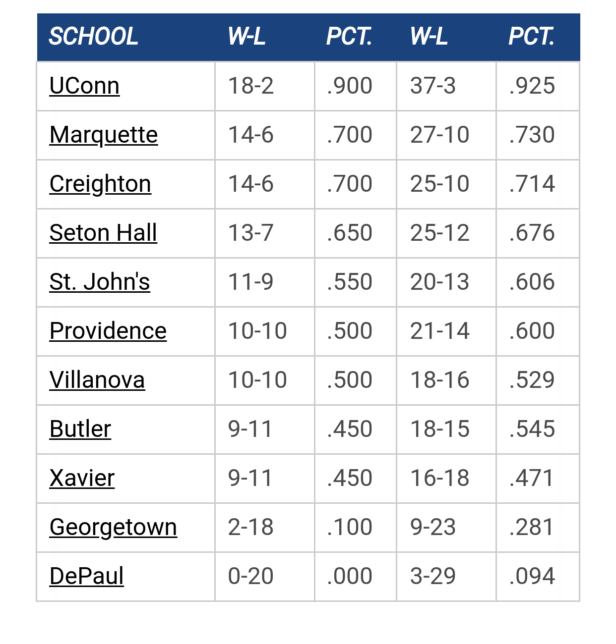
Big East Standings

Recent Posts

Big East job rankings by Vander Blue Man Group
[Today at 12:59:05 PM]


Marquette Team Rankings by Scoop Snoop
[Today at 12:38:05 PM]


[Paint Touches] Analyzing Chase Ross’s Slump: What Went Wrong? by Newsdreams
[Today at 11:48:04 AM]


Going Positive by GoldenEagles03
[Today at 11:28:46 AM]


SOTG by Scoop Snoop
[Today at 10:57:26 AM]


Never A Doubt!! by Scoop Snoop
[Today at 09:14:57 AM]


New Jerseys by Billy Hoyle
[Today at 08:08:47 AM]

Please Register - It's FREE!

The absolute only thing required for this FREE registration is a valid e-mail address. We keep all your information confidential and will NEVER give or sell it to anyone else.
Login to get rid of this box (and ads) , or signup NOW!

Next up: Villanova

Marquette
66
Marquette vs
Villanova
Date/Time: Jan 10, 2026, 1:30pm
TV: TNT/TruTV
Schedule for 2025-26
Xavier
65

Canned Goods n Ammo

Quote from: PuertoRicanNightmare on February 20, 2008, 02:26:41 PM
Quote from: TallTitan34 on February 20, 2008, 02:15:16 PM
I see Georgetown copied our jerseys from 1968-1972.

In the Warriors days our look and "brand" was the envy of almost all of college basketball. I cannot overemphasize this for you younger people. Marquette Warriors, Indiana Hoosiers, UCLA Bruins, North Carolina Tar Heels --- those were the big brands!

I totally respect that and appreciate the insight (honest).


This year's uniforms are a step in the right direction and a clear olive branch, but it's difficult for the people working on marketing Marquette basketball because a huge percentage of supporters of the basketball program would rather burn an item with our current nickname on it then wear something that contains it.

Hmmm....

Golden Eagles is like New Coke, except Coca-Cola had the sense to abandon that disaster.

WARNING: THREAD HIJACK.


Warriors Forever

Please no. The most horrible jerseys ever.

TallTitan34

Is it the font that people don't like on the baby blue jerseys or is it the color?

dwaderoy2004

Why DID the baby blues end up with a different font?  I remember noticing that during the Louisville game.  The replica's sold in the spirit shop have the same font, no matter what color the jersey is.

PuertoRicanNightmare

I like the font BETTER! I don't mind the font on our current ones, but I don't like how it's all stitched into one block.

BrewCity83

Quote from: PuertoRicanNightmare on February 20, 2008, 04:40:26 PM
I like the font BETTER! I don't mind the font on our current ones, but I don't like how it's all stitched into one block.
Agreed.  The stitched-together font looks just like Providence.
The shaka sign, sometimes known as "hang loose", is a gesture of friendly intent often associated with Hawaii and surf culture.

MUfan12

I always thought it would look good to have the lettering from the 2003 jerseys with the current look... kinda blending two great teams into one look. I dabbled in photoshop and came up with this:


Ahoya06

Quote from: MUfan12 on February 20, 2008, 07:07:29 PM
I always thought it would look good to have the lettering from the 2003 jerseys with the current look...

MUfan12, as always, absolutely brilliant. Your Photoshop work throws me back to when we made Marcus Williams-brand laptops together back in '06...

BuzzSucksSucks

Quote from: PuertoRicanNightmare on February 20, 2008, 04:40:26 PM
I like the font BETTER! I don't mind the font on our current ones, but I don't like how it's all stitched into one block.

I second that.  Nice font on the baby blues.

Previous topic - Next topic