Main Menu
collapse

'23-'24 SOTG Tally


2023-24 Season SoG Tally
Kolek11
Ighodaro6
Jones, K.6
Mitchell2
Jones, S.1
Joplin1

'22-23
'21-22 * '20-21 * '19-20
'18-19 * '17-18 * '16-17
'15-16 * '14-15 * '13-14
'12-13 * '11-12 * '10-11

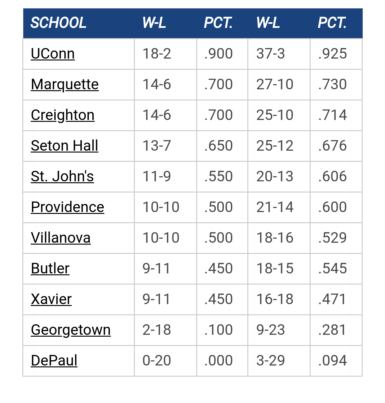
Big East Standings

Recent Posts

Server Upgrade - This is the new server by mileskishnish72
[Today at 07:37:55 PM]


Big East 2024 -25 Results by Uncle Rico
[Today at 06:13:16 PM]


Owens out Monday by TAMU, Knower of Ball
[Today at 03:23:08 PM]


Shaka Preseason Availability by Tyler COLEk
[Today at 03:14:12 PM]


Marquette Picked #3 in Big East Conference Preview by Jay Bee
[Today at 02:04:27 PM]


Get to know Ben Steele by Hidden User
[Today at 12:14:10 PM]


Deleted by TallTitan34
[Today at 09:31:48 AM]

Please Register - It's FREE!

The absolute only thing required for this FREE registration is a valid e-mail address. We keep all your information confidential and will NEVER give or sell it to anyone else.
Login to get rid of this box (and ads) , or register NOW!

Next up: B&G Tip-Off Luncheon

Marquette
Marquette

B&G Luncheon

Date/Time: Oct 31, 2024 11:30am
TV: NA
Schedule for 2023-24
27-10

tower912

I want the giant bleu muppet. 
Luke 6:45   ...A good man produces goodness from the good in his heart; an evil man produces evil out of his store of evil.   Each man speaks from his heart's abundance...

It is better to be fearless and cheerful than cheerless and fearful.

Mu8891

I don't like it ... the stripes on baseline are way too busy. 

But leave the MU alone.... If some people
mistake it for MICH ( U of M ) ... oh well

Frenns Liquor Depot

Quote from: Mu8891 on October 20, 2023, 07:40:35 AM
I don't like it ... the stripes on baseline are way too busy. 

But leave the MU alone.... If some people
mistake it for MICH ( U of M ) ... oh well

It looks busy and really long but game day it will have people/cheer team covering like half of that space so my guess is will look better on game day.

MattyWarrior

At least there's no advertising on it

tower912

It is fine.   Unique, which is what MU should strive for.  Nothing offensive or controversial.    Just because I am not a fan of the championship blue doesn't mean it shouldn't be used.   The scheme will look good on TV with a packed arena.  And most of the time, 'Golden Eagles' will be obscured on TV due to camera angle and fans.
Luke 6:45   ...A good man produces goodness from the good in his heart; an evil man produces evil out of his store of evil.   Each man speaks from his heart's abundance...

It is better to be fearless and cheerful than cheerless and fearful.

21Jumpstreet

Super dig it, screams Marquette

4everwarriors

Quote from: Uncle Rico on October 20, 2023, 07:31:15 AM
I'd like to see an Indian swinging a hatchet and wearing war paint


Reakco, now ur talkin'. 'nough of dis pussification of hour alma mater, aina?
"Give 'Em Hell, Al"

StillAWarrior

Quote from: Mu8891 on October 20, 2023, 07:40:35 AM
But leave the MU alone.... If some people
mistake it for MICH ( U of M ) ... oh well

I also really like the MU logo (and prefer it when they don't include the "Marquette" banner across it as they often do. I'm a generally a fan of lettermarks that are recognizable (e.g., Purdue's P, Georgetown's G, Michigan's M, etc.).
Never wrestle with a pig.  You both get dirty, and the pig likes it.

Uncle Rico

Quote from: 4everwarriors on October 20, 2023, 08:53:01 AM

Reakco, now ur talkin'. 'nough of dis pussification of hour alma mater, aina?

I'd like to see a path on the floor to the opposing teams locker room with tears on it.  Call it the "Trail of Tears" and play God Bless America when they leave the court after victories
Ramsey head thoroughly up his ass.

Hards Alumni

Quote from: 4everwarriors on October 20, 2023, 08:53:01 AM

Reakco, now ur talkin'. 'nough of dis pussification of hour alma mater, aina?

"I miss racism"

wadesworld

Should've just originally kept Warriors as the name but moved away from any imagery and come up with an MU logo at the time.  But it was too late for that.  Ranking the 10 nicknames offered in the vote:

1) Hilltoppers - fairly unique and already in Marquette's history
2) Golden Knights
3) Wolves
4) Golden Eagles
5) Golden Avalanche
6) Blue and Gold?
7) Saints?
8) Voyagers?
9) Explorers?
10) Spirit?

Hilltoppers was the very clear choice.  Could've done a lot of good stuff with that.

As it is, if you're going to have "Golden Eagles" on the court, you should put the Golden Eagle that was on the 2003 shorts at center court.  That's about as good of a logo as you can make for Golden Eagles.

TallTitan34

Quote from: StillAWarrior on October 20, 2023, 08:57:02 AM
I also really like the MU logo (and prefer it when they don't include the "Marquette" banner across it as they often do. I'm a generally a fan of lettermarks that are recognizable (e.g., Purdue's P, Georgetown's G, Michigan's M, etc.).

IIRC they included the Marquette banner across the logo so the new logo could be identified. The long term goal was to transition to the bannerless monogram once the logo was known.


Galway Eagle

Quote from: wadesworld on October 20, 2023, 09:14:45 AM
Should've just originally kept Warriors as the name but moved away from any imagery and come up with an MU logo at the time.  But it was too late for that.  Ranking the 10 nicknames offered in the vote:

1) Hilltoppers - fairly unique and already in Marquette's history
2) Golden Knights
3) Wolves
4) Golden Eagles
5) Golden Avalanche
6) Blue and Gold?
7) Saints?
8) Voyagers?
9) Explorers?
10) Spirit?

Hilltoppers was the very clear choice.  Could've done a lot of good stuff with that.

As it is, if you're going to have "Golden Eagles" on the court, you should put the Golden Eagle that was on the 2003 shorts at center court.  That's about as good of a logo as you can make for Golden Eagles.

Golden Avalanche was better than eagles and wolves. Arguably on par with knights. It was also fairly unique and already a part of MU history. But agree that 03 logo was as good as it could get
Maigh Eo for Sam

muwarrior69

Quote from: Uncle Rico on October 20, 2023, 07:31:15 AM
I'd like to see an Indian swinging a hatchet and wearing war paint

and the scalp of every Badger.

wadesworld

Quote from: Galway Eagle on October 20, 2023, 09:55:28 AM
Golden Avalanche was better than eagles and wolves. Arguably on par with knights. It was also fairly unique and already a part of MU history. But agree that 03 logo was as good as it could get

Yeah 3-5 and 6-10 are all fairly interchangeable in my opinion.  To me Hilltoppers is the clear top choice and I think Golden Knights is a solid second.  Although I less like the actual nickname Golden Knights and more like what you could do with a MSU style logo (or Las Vegas Golden Knights).

Hards Alumni

Quote from: wadesworld on October 20, 2023, 09:14:45 AM
Should've just originally kept Warriors as the name but moved away from any imagery and come up with an MU logo at the time.  But it was too late for that.  Ranking the 10 nicknames offered in the vote:

1) Hilltoppers - fairly unique and already in Marquette's history
2) Golden Knights
3) Wolves
4) Golden Eagles
5) Golden Avalanche
6) Blue and Gold?
7) Saints?
8) Voyagers?
9) Explorers?
10) Spirit?

Hilltoppers was the very clear choice.  Could've done a lot of good stuff with that.

As it is, if you're going to have "Golden Eagles" on the court, you should put the Golden Eagle that was on the 2003 shorts at center court.  That's about as good of a logo as you can make for Golden Eagles.

Nah, even as someone who attended during that period I don't miss that logo at all.

Having said that, the newest iteration of the MU logo is 18 years old.  Could use a refresh. 


That's a good jumping off point.

Or something like this.


I'd alter the color palette to fit Marquette more as well.    But keep the high contrast.  I don't have a clue what to do about font though.

wadesworld

Quote from: Hards Alumni on October 20, 2023, 10:21:23 AM
Nah, even as someone who attended during that period I don't miss that logo at all.

Having said that, the newest iteration of the MU logo is 18 years old.  Could use a refresh. 


That's a good jumping off point.

Or something like this.


I'd alter the color palette to fit Marquette more as well.    But keep the high contrast.  I don't have a clue what to do about font though.

I like the top one.  It just feels almost like the generic logos you could use in like NCAA Football 2010 when you were creating your own school.

Hards Alumni

Quote from: wadesworld on October 20, 2023, 10:22:45 AM
I like the top one.  It just feels almost like the generic logos you could use in like NCAA Football 2010 when you were creating your own school.

Yeah, someone with some actual graphic design talent could make it look much better.

muwarrior69


Galway Eagle

Quote from: wadesworld on October 20, 2023, 10:19:41 AM
Yeah 3-5 and 6-10 are all fairly interchangeable in my opinion.  To me Hilltoppers is the clear top choice and I think Golden Knights is a solid second.  Although I less like the actual nickname Golden Knights and more like what you could do with a MSU style logo (or Las Vegas Golden Knights).


Ah yeah I'd agree with that, definitely more potential with knights than avalanche.

Quote from: Hards Alumni on October 20, 2023, 10:21:23 AM
Nah, even as someone who attended during that period I don't miss that logo at all.

Having said that, the newest iteration of the MU logo is 18 years old.  Could use a refresh. 


That's a good jumping off point.

Or something like this.


I'd alter the color palette to fit Marquette more as well.    But keep the high contrast.  I don't have a clue what to do about font though.

Those are solid. At this point I just want to get rid of the cartoonish logo. Didn't like it in 08 when I got my first shirt for touring MU and here we are 15yrs later without any change except they added the version where it's facing you on some gear.


Wild idea that'd totally get shot down, you know how the Aztecs used to dress as animals for war? What if we did a warrior with a golden eagle war helmet on? No? Canceled? I'll see myself out.
Maigh Eo for Sam

Uncle Rico

Quote from: muwarrior69 on October 20, 2023, 10:18:03 AM
and the scalp of every Badger.

That's not a bad idea.  Maybe a scalp board?  Instead of a rain dance, maybe a rally dance if the good guys fall behind?  Now we're getting somewhere
Ramsey head thoroughly up his ass.

Hards Alumni

Quote from: Uncle Rico on October 20, 2023, 10:45:29 AM
That's not a bad idea.  Maybe a scalp board?  Instead of a rain dance, maybe a rally dance if the good guys fall behind?  Now we're getting somewhere

Pass me the fire water, Reeko!

BrewCity83

Pass me the Peace Pipe
The shaka sign, sometimes known as "hang loose", is a gesture of friendly intent often associated with Hawaii and surf culture.

Uncle Rico

Quote from: BrewCity83 on October 20, 2023, 10:51:48 AM
Pass me the Peace Pipe

I like where your heads are at but I'm not sure Marquette wants to promote peace
Ramsey head thoroughly up his ass.

muwarrior69

Quote from: Uncle Rico on October 20, 2023, 10:54:44 AM
I like where your heads are at but I'm not sure Marquette wants to promote peace

...especially with Badgers.