collapse

Resources

2024-2025 SOTG Tally


2024-25 Season SoG Tally
Jones, K.10
Mitchell6
Joplin4
Ross2
Gold1

'23-24 '22-23
'21-22 * '20-21 * '19-20
'18-19 * '17-18 * '16-17
'15-16 * '14-15 * '13-14
'12-13 * '11-12 * '10-11

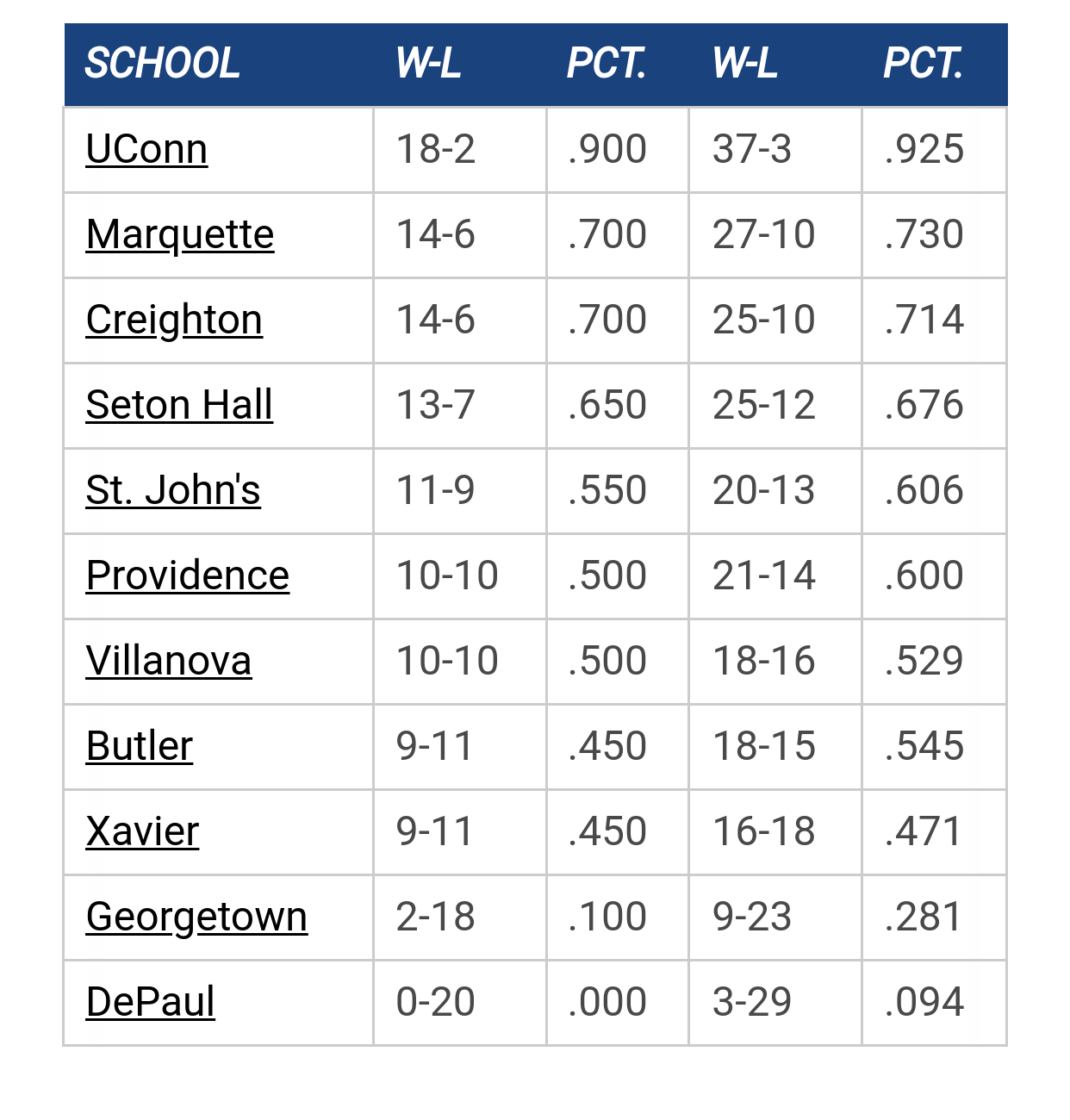
Big East Standings

Recent Posts

Psyched about the future of Marquette hoops by Mutaman
[Today at 12:27:23 AM]


Recruiting as of 7/15/25 by noblewarrior
[July 20, 2025, 08:36:58 PM]


NM by Uncle Rico
[July 20, 2025, 01:53:37 PM]


Scholarship Table by muwarrior69
[July 20, 2025, 11:09:38 AM]


MU @ TBT? by Uncle Rico
[July 20, 2025, 06:29:25 AM]


Open practice by jfp61
[July 19, 2025, 10:03:37 AM]

Please Register - It's FREE!

The absolute only thing required for this FREE registration is a valid e-mail address. We keep all your information confidential and will NEVER give or sell it to anyone else.
Login to get rid of this box (and ads) , or signup NOW!

Next up: A long offseason

Marquette
66
Marquette
Scrimmage
Date/Time: Oct 4, 2025
TV: NA
Schedule for 2024-25
New Mexico
75

🏀

can someone tell them to get a new monogram?


I mean, come on. This was okay for the MVC, but not the Big East. It's really runing TT34's signature right now. X has a really nice monogram, and I'll give Butler's a C. Creighton, step the game up.

🏀

Plus, it would take me 15 minutes to turn that into a convincing looking 'GAYS'.

esotericmindguy

Quote from: PTM on March 20, 2013, 08:11:30 PM
Plus, it would take me 15 minutes to turn that into a convincing looking 'GAYS'.

Your words are hurtful

chapman

#3
Yeah, looking at TT's graphic:


It sticks out, but in a lame way.  

I like the Bluejay, cool looking bird and unique.


Something like the Toronto Bluejays logo could look good, get the Creighton Bluejay head, flip it to put the C around the head on the left.  Or just keep it simple and take the bird's head, or just take the 'C' on the bird's shirt and use that.


hairy worthen

Quote from: PTM on March 20, 2013, 08:11:30 PM
Plus, it would take me 15 minutes to turn that into a convincing looking 'GAYS'.

Not that there is anything wrong with that

Eldon

When I saw that signature, I thought the exact same thing--man Creighton needs a new logo

I like the secondary logo (that awesome pissed off bluejay).

Isn't that the same "Jays" as the potato chips anyway?


chapman

Quote from: ElDonBDon on March 20, 2013, 08:43:10 PM
Isn't that the same "Jays" as the potato chips anyway?

Ha, knew I'd seen it somewhere else.

🏀

The pissed Jay is sweet. Take that face, class it up like SH did.

warriorchick

Quote from: ElDonBDon on March 20, 2013, 08:43:10 PM
When I saw that signature, I thought the exact same thing--man Creighton needs a new logo

I like the secondary logo (that awesome pissed off bluejay).

Isn't that the same "Jays" as the potato chips anyway?


Can't stop eatin' em!
Have some patience, FFS.

jesmu84

At least they've got a bird that actually looks intimidating...

Do they have a bluejay mascot?

warriorchick

Quote from: jesmu84 on March 20, 2013, 09:31:09 PM
At least they've got a bird that actually looks intimidating...

Do they have a bluejay mascot?

I don't think he looks intimidating; just annoyed.
Have some patience, FFS.

keefe

I think before we go casting stones at other school mascots and other associated nomenclature we should get our own house in order. Who in their right mind thinks anything good about our stupid bird image? How embarrassing.


Death on call

MUMountin

Makes me really appreciate the MU monogram that they developed in the rebranding post-Gold infamy.  I think that was a great move, and is much more recognizable and classy than the old eagle.

MUBBau

Quote from: keefe on March 20, 2013, 10:16:24 PM
Who in their right mind thinks anything good about our stupid bird image? How embarrassing.


TallTitan does

TallTitan34


keefe

Quote from: warriorchick on March 20, 2013, 10:08:26 PM
I don't think he looks intimidating; just annoyed.

Annoyed or perhaps petulant indignation.


Death on call

TallTitan34

This was on google. A little better.


mug644

Quote from: keefe on March 20, 2013, 10:24:59 PM
Annoyed or perhaps petulant indignation.

Rather than petulant indignation, I see persistent indigestion.

wadesworld

Quote from: chapman on March 20, 2013, 08:22:05 PM
Yeah, looking at TT's graphic:


It sticks out, but in a lame way.  

I like the Bluejay, cool looking bird and unique.


Something like the Toronto Bluejays logo could look good, get the Creighton Bluejay head, flip it to put the C around the head on the left.  Or just keep it simple and take the bird's head, or just take the 'C' on the bird's shirt and use that.


Looks more like the bird is going through vinegar strokes rather than being pissed off, especially with the position of it's hand...

The Process

Quote from: wadesworld on March 20, 2013, 11:34:01 PM
Looks more like the bird is going through vinegar strokes rather than being pissed off, especially with the position of it's hand...

Speaking of Vinegar Strokes... my avatar is Jeff Goldblum from his *ahem* unforgettable appearance on The League.

And for the few of you who are unfamiliar with the term Vinegar Strokes:

http://www.youtube.com/v/UWVFpQey5wo
Relax. Respect the Process.

77ncaachamps

Rock Chalk Jay......C.......U........
SS Marquette

MU Fan in Connecticut

Quote from: ElDonBDon on March 20, 2013, 08:43:10 PM
When I saw that signature, I thought the exact same thing--man Creighton needs a new logo

I like the secondary logo (that awesome pissed off bluejay).

Isn't that the same "Jays" as the potato chips anyway?


Peppermint Patty logo?

Previous topic - Next topic