Main Menu
collapse

Resources

2024-2025 SOTG Tally


2024-25 Season SoG Tally
Jones, K.10
Mitchell6
Joplin4
Ross2
Gold1

'23-24 '22-23
'21-22 * '20-21 * '19-20
'18-19 * '17-18 * '16-17
'15-16 * '14-15 * '13-14
'12-13 * '11-12 * '10-11

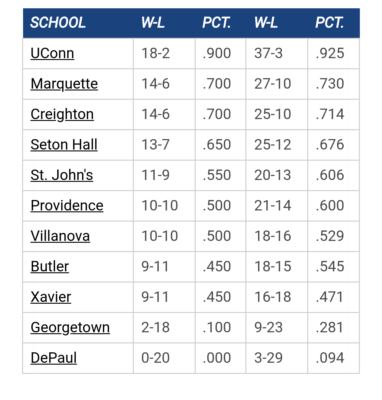
Big East Standings

Recent Posts

What is the actual gap between Marquette and the top of the Big East by GB Warrior
[May 15, 2025, 11:33:44 PM]


Marquette NBA Thread by MU82
[May 15, 2025, 10:30:16 PM]


2026 Bracketology by MU82
[May 15, 2025, 10:22:37 PM]


Kam update by We R Final Four
[May 15, 2025, 05:47:36 PM]


Recruiting as of 5/15/25 by ATL MU Warrior
[May 15, 2025, 04:46:07 PM]


2025 Transfer Portal by wadesworld
[May 15, 2025, 04:31:57 PM]


Pearson to MU by We R Final Four
[May 15, 2025, 04:13:02 PM]

Please Register - It's FREE!

The absolute only thing required for this FREE registration is a valid e-mail address. We keep all your information confidential and will NEVER give or sell it to anyone else.
Login to get rid of this box (and ads) , or signup NOW!

Next up: A long offseason

Marquette
66
Marquette
Scrimmage
Date/Time: Oct 4, 2025
TV: NA
Schedule for 2024-25
New Mexico
75

TallTitan34

Looking at the photos and videos from the scrimmages, I like the teal more than the baby blues.  The shade is similar to the 70s set.  I think I would prefer the name and number to be gold (yellow) on the teals like the 70s set.

GooooMarquette

Quote from: Shooter McGavin on November 30, 2020, 08:20:48 AM
He's joking


Shoulda had my morning coffee before posting....

MUfan12

Quote from: BLM on November 29, 2020, 05:48:40 PM
The shorts are awesome. The back of the jerseys are nice. The front are meh. Friday's color was a one time thing I believe.

It's all so busy on the front of the jersey. Swoopy color on the shoulder, major italicized script, different number font, four logos/patches. They look like a damn NASCAR pit crew.

cheebs09

Quote from: MUfan12 on November 30, 2020, 09:19:19 AM
It's all so busy on the front of the jersey. Swoopy color on the shoulder, major italicized script, different number font, four logos/patches. They look like a damn NASCAR pit crew.

Agreed. Not sure why they didn't put the Big East logo on the back like the Big 3 era.

I think it was a mistake to bring the flag back. Doesn't really make sense on a uniform and it probably will result in complaining whenever they remove it.

The uniforms look much better as a set other than the front of the jersey. I do like the turquoise better as a nod to the 70s. The previous N7 jerseys were kind of grade schoolish if I remember, so I feel like they never got a fair shot.


cheebs09

Quote from: oldwarrior81 on November 30, 2020, 11:48:33 AM
I thought the 2019 version they wore against Robert Morris was weak.
https://news.sportslogos.net/wp-content/uploads/2019/11/EJqhsOWXUAAe0Yc-590x393.jpeg

the earlier version was done with the jersey sets that came out for the centennial.
https://cdn.vox-cdn.com/thumbor/AOMk0Ob6zovuu0Bgvkf7elNDZaY=/0x0:1024x458/920x613/filters:focal(417x59:579x221):format(webp)/cdn.vox-cdn.com/uploads/chorus_image/image/51850519/2016_N7_MBB_uniforms.0.jpeg

Thanks for that. For some reason I thought we wore plain turquoise jerseys when we had the uniforms before the Centennial. However, it looks like we just wore special shoes.

Previous topic - Next topic