Main Menu
collapse

Resources

2024-2025 SOTG Tally


2024-25 Season SoG Tally
Jones, K.10
Mitchell6
Joplin4
Ross2
Gold1

'23-24 '22-23
'21-22 * '20-21 * '19-20
'18-19 * '17-18 * '16-17
'15-16 * '14-15 * '13-14
'12-13 * '11-12 * '10-11

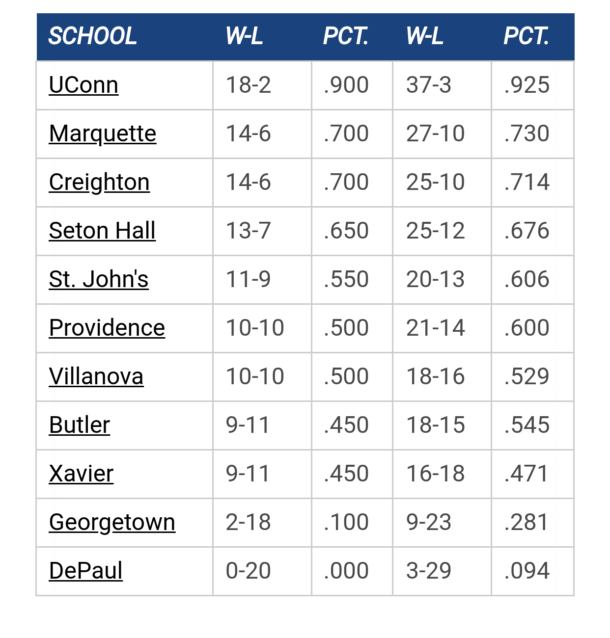
Big East Standings

Recent Posts

Welcome, BJ Matthews by Shooter McGavin
[September 17, 2025, 09:04:04 PM]


Recruiting as of 9/15/25 by Stretchdeltsig
[September 17, 2025, 04:39:09 PM]


Marquette NBA Thread by MU82
[September 17, 2025, 12:15:58 PM]


[Cracked Sidewalks] Previewing Marquette's Schedule by PointWarrior
[September 16, 2025, 08:55:54 PM]

Please Register - It's FREE!

The absolute only thing required for this FREE registration is a valid e-mail address. We keep all your information confidential and will NEVER give or sell it to anyone else.
Login to get rid of this box (and ads) , or signup NOW!

Next up: A long offseason

Marquette
66
Marquette
Scrimmage
Date/Time: Oct 4, 2025
TV: NA
Schedule for 2024-25
New Mexico
75

DomJamesToTheBasket

Quote from: Jblattner7 on February 01, 2012, 11:28:38 AM
anyone else think that the "Marquette" across the chest would look good in Cursive? Kind of like the Memphis throwbacks? Lots of teams used to have their names in cursive, more like Baseball uniforms... The bulls, Michigan State, think they look pretty cool and would be nice on our jerseys...
I have an early 80's sweatshirt with Marquette in cursive.  I think it would look really awesome on a jersey.

JTBMU7

yes, i like it with the cursive. something about the block Marquette with the different font #s looks odd on the current uni's... i know it's supposed to look like the 70's font, but i'd love to see the cursive on the baby blues...

wildbill sb

Quote from: TallTitan34 on February 01, 2012, 11:26:31 AM
Pink for coaches-vs-cancer, not so much...


Maybe your color choice is a little too lavender, no?  Can you render a little pinker pink perhaps?
“I’m working as hard as I can to get my life and my cash to run out at the same time. If I can just die after lunch Tuesday, everything will be perfect.”  - Doug Sanders, professional golfer

DomJamesToTheBasket

#28
Quote from: Jblattner7 on February 01, 2012, 06:25:44 PM
yes, i like it with the cursive. something about the block Marquette with the different font #s looks odd on the current uni's... i know it's supposed to look like the 70's font, but i'd love to see the cursive on the baby blues...
I'm with you on the dislike of the baby blues font...

The "Q" looks like Cartman's package...

BrewCity83

Quote from: TallTitan34 on February 01, 2012, 11:26:31 AM
Pink for coaches-vs-cancer, not so much...


I think it would look a lot better if you substituted pink for all of the yellow in the jersey...since the pink and yellow clash.  And use a lighter shade of pink so it's just navy, light blue, pink and white.

I also like the gray version, but I bet it would look even better if it were more of a silver rather than the dark gray.
The shaka sign, sometimes known as "hang loose", is a gesture of friendly intent often associated with Hawaii and surf culture.

cheebs09

These Duke uniforms are awful. Can't see the numbers at all and I just don't think it looks good on their court.

Previous topic - Next topic