collapse

Resources

2024-2025 SOTG Tally


2024-25 Season SoG Tally
Jones, K.10
Mitchell6
Joplin4
Ross2
Gold1

'23-24 '22-23
'21-22 * '20-21 * '19-20
'18-19 * '17-18 * '16-17
'15-16 * '14-15 * '13-14
'12-13 * '11-12 * '10-11

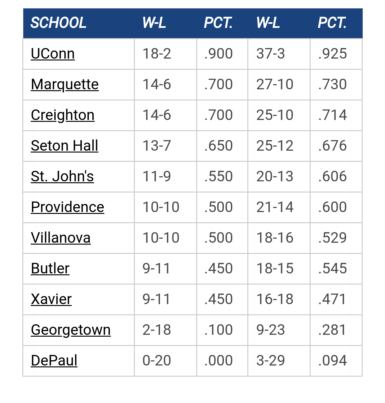
Big East Standings

Recent Posts

Nash Walker commits to MU by Juan Anderson's Mixtape
[July 10, 2025, 10:33:41 PM]


Congrats to Royce by tower912
[July 10, 2025, 09:00:17 PM]


Recruiting as of 7/15/25 by Farley36
[July 10, 2025, 08:45:43 PM]


Kam update by seakm4
[July 10, 2025, 07:40:03 PM]


More conference realignment talk by WhiteTrash
[July 10, 2025, 12:16:36 PM]


2025-26 Schedule by Shaka Shart
[July 10, 2025, 01:36:32 AM]


Marquette freshmen at Goolsby's 7/12 by BCHoopster
[July 09, 2025, 10:13:46 PM]

Please Register - It's FREE!

The absolute only thing required for this FREE registration is a valid e-mail address. We keep all your information confidential and will NEVER give or sell it to anyone else.
Login to get rid of this box (and ads) , or signup NOW!

Next up: A long offseason

Marquette
66
Marquette
Scrimmage
Date/Time: Oct 4, 2025
TV: NA
Schedule for 2024-25
New Mexico
75

MUfan12

They're wearing the baby blues tonight.

WE'RE FREAKING SCREWED!

Glad we got that out of the way.

MR.HAYWARD


chapman

Is the curse broken if we keep it within 20 or do we actually have to win?

MUDude4

But we beat Florida Gulf Coast wearing the baby blue jerseys.

nyg

Quote from: MUfan12 on December 29, 2009, 05:01:19 PM
They're wearing the baby blues tonight.

WE'RE FREAKING SCREWED!

Glad we got that out of the way.

Should have worn them last game.

NumenFlumenque

Does anybody know why the text for these jerseys is different than our normal golds and blues? The baby blues' "MARQUETTE" has individual letters stitched on as opposed to one big name.

DomJamesToTheBasket

Quote from: NumenFlumenque on December 29, 2009, 06:21:18 PM
Does anybody know why the text for these jerseys is different than our normal golds and blues? The baby blues' "MARQUETTE" has individual letters stitched on as opposed to one big name.
The font is the only thing I don't like. It is really bad.  With a name as long as Marquette,  you need some arc.  Hopefully, that gets changed......how about cursive???  That's my favorite.

MUfan12

Before Chicos and 84 jump down my throat, this is what went down with the jerseys.

Crean had control over the jersey design when the Converse deal was signed. The original design was the one they sell in the Spirit Shop. TC didn't think it was "retro" enough, so he had that block font taken from the letterhead and put on the jerseys instead. It looks horrid.

4everwarriors

Quote from: MUfan12 on December 29, 2009, 06:58:06 PM
Before Chicos and 84 jump down my throat, this is what went down with the jerseys.

Crean had control over the jersey design when the Converse deal was signed. The original design was the one they sell in the Spirit Shop. TC didn't think it was "retro" enough, so he had that block font taken from the letterhead and put on the jerseys instead. It looks horrid.

That coming from the same dude who can't get a decent haircut or learn the proper tie length. He also thought Gold would be a great nickname.
"Give 'Em Hell, Al"

PuertoRicanNightmare

Quote from: MUfan12 on December 29, 2009, 06:58:06 PM
Before Chicos and 84 jump down my throat, this is what went down with the jerseys.

Crean had control over the jersey design when the Converse deal was signed. The original design was the one they sell in the Spirit Shop. TC didn't think it was "retro" enough, so he had that block font taken from the letterhead and put on the jerseys instead. It looks horrid.
Can you clarify? I actually like the lettering on the baby blues. Was that the original lettering on all jerseys? I think the block font looks mentally challenged.

GGGG

I blame the jerseys for the half court shot at the end of the half.   :P

MUfan12

Quote from: PuertoRicanNightmare on December 29, 2009, 07:05:23 PM
Can you clarify? I actually like the lettering on the baby blues. Was that the original lettering on all jerseys? I think the block font looks mentally challenged.

The font on the other three jerseys was supposed to be on the baby blues as well. The baby blues got changed last minute.

Skitch

Before last season (or maybe it was the '07-'08 season) uniwatch on espn.com had a baby blue throwback that Marquette was supposed to wear but I don't think I've ever seen it. Anyone know anything about this?

BrewCity83

That one on uniwatch was the actual old jersey that MU wore around 1974 that these new ones were inspired by.  I think it's hanging in a display case at the Al.

For the record, I think the font on the baby blues looks better than on the other jerseys.  I also think the boys showed last night that they can play well in the baby blues.  The jinx is off--we beat the spread.
The shaka sign, sometimes known as "hang loose", is a gesture of friendly intent often associated with Hawaii and surf culture.

Litehouse

Quote from: BrewCity on December 30, 2009, 07:55:17 AM
For the record, I think the font on the baby blues looks better than on the other jerseys.

I agree, I like the font on the "electric" blues better also, it looks more unique.  Nothing necessarily wrong with the other ones, they just look like generic jersey lettering.

Marquette84

Quote from: MUfan12 on December 29, 2009, 06:58:06 PM
Before Chicos and 84 jump down my throat, this is what went down with the jerseys.

Crean had control over the jersey design when the Converse deal was signed. The original design was the one they sell in the Spirit Shop. TC didn't think it was "retro" enough, so he had that block font taken from the letterhead and put on the jerseys instead. It looks horrid.

I have no problem with the lettering, so I'll refrain from jumping down anybody's throat.  However, after last night I'd like to see the baby blues retired permanently. 

I do prefer a more classic lettering over the modern text used on the gold/white/dark blue.  Curved or straight I don't care.

Meanwhile, we should petition the NCAA to bring back the bumblebees.  Or stick with gold.  Or bring back the Big Blue Ball.  Anything other than having to endure another loss-inducing baby blue game.

MUfan12

I always thought it would look nice if they took the lettering off of the 03 jerseys and put it on the current design. Just a consistent, clean block lettering. Would really help with the "throwback" vibe they tried to get.

ChuckyChip

These woman's retro jerserys are awesome!  That blue is the color that the mens uniforms were and should be now - not that lame powder blue.

http://www.gomarquette.com/

nyg

Quote from: ChuckyChip on December 31, 2009, 02:15:22 PM
These woman's retro jerserys are awesome!  That blue is the color that the mens uniforms were and should be now - not that lame powder blue.

http://www.gomarquette.com/

Agree 100%.  Modify the unis for next year under the Jordan brand.

wesmat23

I wish they would wear these uni's more often. Only thing is I think they should have the MARQUETTE lettering like that on there other colered jerseys. No need to be so supersticious. Jersey color being worn has nothing to do with wins and losses. We had plenty of chances to seal the deal on Tuesday but played horrible in the last :30 some seconds.

MUfan12

Finally found it, thanks to the wiki.

Here's the "retro" look for those jerseys, aka their letterhead from 2006-07.

http://wiki.muscoop.com/lib/exe/fetch.php/nickname/risingson.jpg?cache=cache

77ncaachamps

Quote from: ChuckyChip on December 31, 2009, 02:15:22 PM
These woman's retro jerserys are awesome!  That blue is the color that the mens uniforms were and should be now - not that lame powder blue.

http://www.gomarquette.com/

The Lettering is vintage Marquette (from 82-83, I believe).

But the jerseys are GOD-AWFUL! they look like cheap, iron-on replicas!
SS Marquette

Previous topic - Next topic